How to Make a Cartoon Logo: Tools, Steps & Exports
Learn how to make a cartoon logo with the right tools, step-by-step creation, design tips, and export formats for branding, marketing, and merch.
Understanding cartoon logos (and why they work)
A cartoon logo is a brand mark built with playful, illustrated shapes and character-like features. It often uses rounded forms, simple outlines, and a limited color set to feel friendly and memorable. For many brands, this style creates instant warmth, even before people read any text.
The appeal is practical. Cartoon logos tend to be easier to recognize at small sizes because the shapes stay bold and clear. They also give you more room to express personality through illustrative elements, like a mascot, an object, or a scene.
Cartoon logo design still needs visual identity rules. The “cartoon” look is not a free-for-all. You want consistent lines, a readable icon, and colors that support your brand message across platforms.
- Personality: Friendly, approachable, and human
- Recognition: Bold shapes that work in small sizes
- Flexibility: Easy to adapt for marketing and merch
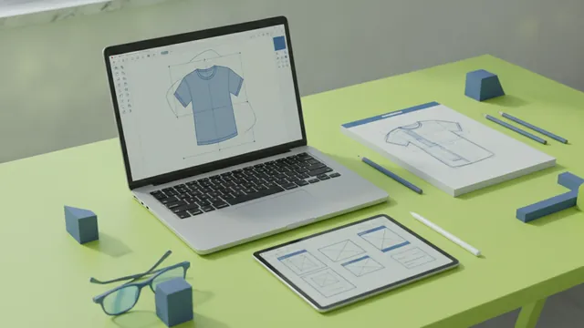
Choosing the right tools for your cartoon logo
Your tool choice affects quality, speed, and export options. If your goal is how to make a cartoon logo for free, start with an online logo maker or a simple vector editor. If you want long-term control, use design software that exports clean vector files.
For beginners, online logo makers can be fast. You pick a template style, type your brand name, then swap icons and colors. The tradeoff is that you may not fully own the editable design, and customization can feel limited.
For graphic design tools, vector-first software is ideal. Vector graphics scale without blur, which matters when your cartoon logo appears on stickers, shop signs, and website headers. Many tools also support exporting multiple file types from one master design.
Tool options by skill level
- Online logo makers: Quick layouts, easy color swaps, fast exports
- Vector design software: Best for logo scalability and custom illustrative elements
- Illustration tools: Great if you want a character style with richer textures
- Collaboration tools: Useful for getting feedback and iterating branding choices
If you want how to make a cartoon logo of yourself, choose tools that support importing a reference image and then tracing or simplifying facial features into clean shapes. The goal is not realism. The goal is a clear cartoon interpretation you can reproduce consistently.
Step-by-step guide: how to make a cartoon logo
Here is a practical workflow you can follow to how to make your own cartoon logo from an idea to export-ready files. You can do this with an online maker or with vector software. Keep the process structured, because cartoon logos succeed when the shapes and palette stay consistent.
- Write down your brand basics: List your brand name, audience, and what you want to feel. A cartoon logo for a bakery should read warmth and comfort. A cartoon business logo for a tech service may feel playful but still organized.
- Choose a cartoon style direction: Decide on the level of detail. You can go with flat shapes, thick outlines, or a more character-like look with expressive features.
- Build a simple icon first: Start with one core illustrative element. Examples include a character mascot, an object tied to your offer, or a small scene that reads at a glance.
- Enter your brand name (if needed): Place the text near the icon. Use typography that matches the cartoon tone. Keep letterforms readable, even when the logo is small.
- Select a tight color palette: Pick 2–4 main colors. Add one accent shade for emphasis. Too many colors can make cartoon logo design look messy.
- Customize illustrative elements: Adjust expressions, angles, and shapes until the logo feels balanced. For character logos, test different facial expressions. For object logos, refine outlines so they match the icon style.
- Check spacing and alignment: Ensure the icon, text, and any decorative elements have consistent padding. Cartoon logos often fail when details crowd the center.
- Create export-ready versions: Make sure you have an icon-only version, a horizontal lockup, and a stacked layout.
When you learn how to make a cartoon business logo, the “business” part is about clarity and reuse. Your logo should work on your website, invoices, and social posts. That means you should design for both color and one-color use early.
If your goal is how do you make a cartoon logo of yourself for free, simplify your features. Focus on a recognizable silhouette, then exaggerate one or two traits. For example, use bold eyebrows, a clearer smile shape, or a simplified hairstyle outline.
Design elements to consider (so it looks like a real brand)
A strong cartoon logo has three anchor elements: color palette, typography, and imagery. If one element conflicts with the others, the logo can feel random. Use a consistent style for outlines and shape corners across the icon and any character features.
Color palettes that fit your message
Color psychology helps you pick shades that match the vibe. Warm colors like oranges and reds often feel energetic and friendly. Cool colors like blues can feel calm and trustworthy. Use your palette like a promise, not like decoration.
| Goal | Common vibe | Palette idea |
|---|---|---|
| Approachability | Friendly and open | Warm neutrals + a bright accent |
| Trust | Reliable and steady | Deep blue + muted secondary |
| Energy | Active and bold | Orange or red + dark outline |
Keep contrast high for text. Many cartoon logos include a dark outline or a strong shadow to keep elements readable.
Typography that stays legible
Typography should match the cartoon tone, but remain readable. Avoid overly thin fonts that disappear at small sizes. If you use a rounded display type, test it under 24 px. If it looks squished, switch to a bolder weight.
Pairing helps. Many brands use a cartoon icon with a simple, clean typeface. This combination keeps the logo playful without sacrificing clarity.
Illustrative elements and composition
Decide what your logo communicates in one second. If the icon is a character, its expression should be clear even when simplified. If it is an object, the silhouette should be recognizable without color.
Also, treat lines and shapes like a system. For example, if you use thick outlines for the main character, keep outlines consistent on small details. If you use flat fills, avoid mixing heavy gradients unless the tool supports a clean style.
Tips for customizing your logo and keeping it scalable
Customization is where your logo becomes yours. But scaling is where most designs break. You want logo scalability so the same identity works on a favicon, a banner, and a hoodie.
- Design a vector master: Build in scalable shapes so edges stay crisp.
- Create an icon-only version: This helps when space is tight.
- Limit detail density: Small logos need fewer tiny elements.
- Test with one-color: Your logo should still look good in black and white.
- Use safe spacing: Keep text and icon separated so they never blend.
If you are figuring out how to cartoon logo ideas from a personal photo reference, keep the final look stylized. Trace simplified shapes, then refine with consistent line weight. That makes the result repeatable and reduces “uncanny” realism.
For how to make cartoon logo for business use cases, plan for multiple backgrounds. If you use bright fills, create a version with a solid background and one that works on dark and light pages.
Finalizing and downloading your logo in the right formats
Once the design feels balanced, finalize it like a brand asset, not a draft. Create the file set you will need for web, print, and marketing. This reduces rework later when someone asks for a transparent version or a high-resolution export.
When you finalize, verify alignment and spacing one last time. Zoom out and then zoom in. Cartoon elements should still read clearly when small details disappear.
Common download formats and when to use them
| Format | Best for | Notes |
|---|---|---|
| SVG | Web icons, responsive layouts | Scales cleanly, great for vector workflows |
| PNG | Transparent backgrounds | Works well for social posts and quick uploads |
| JPG | Low-friction sharing | Not ideal for transparency |
| Print and designer handoff | Often accepted by print shops | |
| EPS | Legacy print workflows | Some print systems still prefer it |
For how to make a cartoon logo that stays consistent, keep the original editable vector file too. Then export labeled versions like “logo-horizontal,” “logo-stack,” and “logo-icon.” That naming reduces mistakes during handoff.
Use cases and applications for cartoon logos
A cartoon logo works best when you want a recognizable, friendly visual identity. It can anchor your branding across websites, email headers, and social profiles. The playful look can also make your marketing feel less corporate while still staying professional.
Cartoon logo applications extend into physical goods. Many brands print mascot icons on stickers, packaging, and promotional items. You can also adapt the same illustration into smaller badges for campaigns and seasonal offers.
- Branding: Website header, app icon, and email signature
- Marketing: Social post templates and ad creatives
- Merchandise: Stickers, mugs, t-shirts, and packaging labels
- Community: Event badges and sponsor graphics
If you are learning how to make a cartoon business logo, remember that consistency beats novelty. Use the same palette and outline style across every asset. When your logo stays consistent, customers start to recognize it instantly.
And if your plan is how to make a cartoon logo of yourself, treat it like a personal brand system. Use it for speaker badges, creator profiles, and small merch drops. The cartoon interpretation can become a signature visual, not just a one-off picture.
Frequently asked questions
- How do I make a cartoon logo for free?
- You can start with an online logo maker to build a fast draft. Then export the best version you can and recreate it in vector software if you need deeper customization.
- How do I make a cartoon logo of myself?
- Use a reference photo, then simplify features into bold shapes. Focus on recognizable silhouette and one or two expressive traits for a clean, repeatable cartoon look.
- How do I make a cartoon business logo that looks professional?
- Use consistent outlines, limit your palette to a few colors, and keep typography legible. Create icon-only and one-color versions so your logo works on every channel.
- What are the best colors for cartoon logo design?
- Pick colors that match your brand mood, then keep contrast strong for readability. Test your palette on both light and dark backgrounds.
- What file formats should I download for my cartoon logo?
- Aim for SVG for scalable web use, PNG for transparent backgrounds, and PDF for print handoffs. Include icon-only and stacked exports for flexible placement.
Related reading
How to Make a Business Logo: Tools, Tips, and Final Files
Step-by-step logo design: free tools, phone workflows, and final export tips.
How to Make T Shirt Logos: From Idea to Print-Ready Art
Learn how to make t shirt logos, from idea to print-ready design.
How to Create Animated Logo Videos for Free (No Skills Needed)
Create a polished animated logo video for free with online tools.