Left Chest Logo Size Guide for Garments (By Measurements)
Get exact measurements for left chest logos on t-shirts, polos, hoodies, and kids’ clothes. Learn where to place the logo and how to size it.
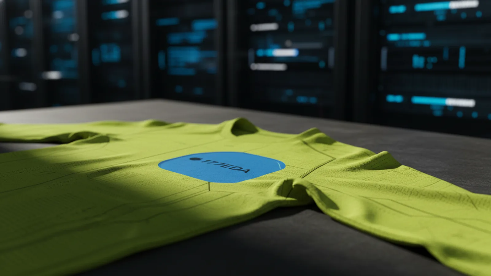
Introduction to left chest logos
If you’re wondering “how big should a left chest logo be,” the short answer is this: most adult tops use a square logo around 2.5–5 inches wide, and placement is measured from the shoulder seam. The goal is visibility without distortion on different garment shapes. When you size and position correctly, embroidery or print stays crisp and looks intentional.
This guide covers the standard size of a left chest logo for common garment types. It also explains where to place left chest logo designs using simple measurement rules. You’ll also get adjustment tips for fit differences between styles and for women’s garments.
- Use garment-specific size standards as your starting point.
- Measure vertically from the shoulder seam every time.
- Adjust for women’s sizing by raising the logo slightly.
Standard logo size for the left chest
Branding needs consistency, but garment size changes the surface area you can use. A good reference is a standard, balanced left chest logo that reads well at a small scale. If your designer asks “what size should a left chest logo be,” these values are a strong baseline.
For adult t-shirts, use a logo size of 2.5–5 inches square. This range covers most brands and works for both single-color and multi-color embroidery. If you only know one number, pick 4 inches square for a typical adult tee.
For adult polos and adult hoodies, the standard size is 3.5 x 3.5 inches. These garments tend to have more vertical structure, so a square mark fits cleanly without feeling too small. If the fabric is heavy, you can stay near 3.5 inches for best readability.
For toddlers, use a logo size of 2.5 x 2.5 inches. At small sizes, fine details get lost, so keep your mark simple and bold. The same rule applies to children’s garments: smaller logos need cleaner shapes.
| Garment type | Standard left chest logo size |
|---|---|
| Adult t-shirt | 2.5–5 inches square |
| Adult polo | 3.5 x 3.5 inches |
| Adult hoodie | 3.5 x 3.5 inches |
| Toddler | 2.5 x 2.5 inches |
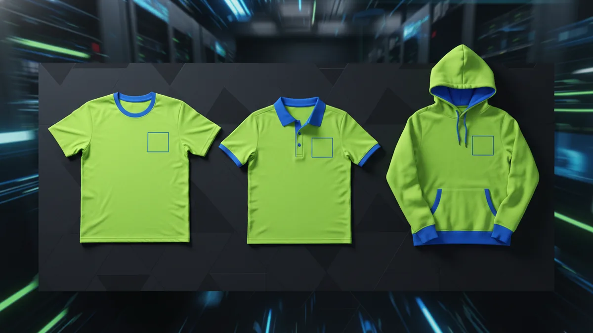
Placement guidelines for left chest logos
Knowing how to place left chest logo artwork is mostly about vertical placement. The easiest measurement is the distance from the shoulder seam to the top edge of the logo. Use the same reference for every garment so your branding stays aligned across a product line.
For t-shirts, place the logo 3–4 inches below the shoulder seam. If you want a tighter, more classic look, use 3 inches. For a slightly more relaxed look, use closer to 4 inches, especially on longer tees.
For polos, place the logo 7–9 inches below the shoulder seam. Polos often have a thicker collar area, so the logo naturally sits lower than on a tee. If your polo has a taller placket or a wide collar, use the upper end of the range.
For hoodies, place the logo 5.5–8 inches below the shoulder seam. Hoodies vary a lot by pocket and sleeve cut, so test with your exact pattern. When in doubt, start near the middle of the range and adjust after a physical mockup.
For women’s garments, raise the logo 1 inch higher than men’s standards. Women’s shoulder lines usually sit differently relative to the chest, so the “same” placement often lands too low. This one-inch lift usually keeps the logo in the same visual zone across genders.
- T-shirts: 3–4 inches below shoulder seam.
- Polos: 7–9 inches below shoulder seam.
- Hoodies: 5.5–8 inches below shoulder seam.
- Women’s: raise 1 inch vs men’s placement.
Adjustment tips for different garments and age groups
Garment types affect how a left chest logo “feels,” even when your measurements are correct. T-shirts drape differently than polos. Hoodies have bulk that can push the logo out of place if you ignore fabric thickness.
If you’re doing size adjustments for children, treat it like a visibility problem, not just a scaling problem. A toddler logo should be 2.5 x 2.5 inches, but you should also simplify details so embroidery best practices hold up at small scale. Avoid tiny lettering and very thin linework, since they can disappear after stitching.
When a garment has design features, you may need to shift your placement slightly. The logo should not land on high-contrast areas like stripes or busy prints. If your placement guidelines put the logo near a pocket edge or a seam, nudge it so the logo stays fully on smooth fabric.
Also watch for “fit drift” across sizes. A logo placed perfectly on a sample may shift on smaller youth sizes if the shoulder seam changes position. Use a quick paper or vinyl template on the actual size range to confirm alignment.
- Start with the standard size for the garment type.
- Measure vertical distance from the shoulder seam.
- Do a physical mockup on the final size, not just one sample.
- Adjust by small amounts to avoid seams, buttons, and pockets.
Design considerations for left chest logos
Size standards and placement are only half the job. Your logo design must stay readable at a small footprint. That’s especially important for embroidery, where tiny gaps and thin strokes can break down.
Keep shapes simple and the color contrast strong. A high-contrast logo reads better on darker or lighter shirts, even at the small sizes used on the left chest. If you’re using multiple colors, make sure the lightest parts are still distinguishable on the chosen fabric.
Consider the manufacturing method when you choose your design optimization. For embroidery, bold outlines and clear negative space usually stitch cleanly. For screen print, you have more flexibility, but very fine detail can still look soft at small size.
Printable templates can also help. If you’re preparing files for a vendor, generate a template that matches your measurements. Then you can visually confirm where to place left chest logo artwork before you send production files.
- Prioritize readability over complexity.
- Use strong contrast for visibility on fabric.
- Design for embroidery best practices if stitching is the goal.
- Use printable templates to validate placement.
Common mistakes to avoid
Even with correct sizes, small placement errors can make branding look off. The most common mistake is placing the logo too high or too low relative to the shoulder seam reference. If you measure from the neck or collar instead, the design will not line up across garment types.
A second mistake is letting the logo sit on or too near functional parts. Avoid placing logos over buttons, stripes, or pockets. Those areas create visual clutter and can also affect manufacturing quality due to tension and shape changes.
Another common issue is assuming the same logo size for every garment. Polos and hoodies generally use the 3.5 x 3.5 inch standard, while t-shirts use a broader 2.5–5 inch range. If you use a “tee” size on a hoodie, it may look small and unbalanced.
Finally, skip over the women’s adjustment at your own risk. If you don’t raise the logo 1 inch higher for women’s garments, it often ends up too low on the chest. That can make the logo look like an afterthought.
| Mistake | What it causes | Fix |
|---|---|---|
| Wrong measurement reference | Inconsistent logo alignment | Measure from shoulder seam |
| Logo over pockets or buttons | Cluttered look and poor stitch fit | Shift away from hardware |
| One size across all garments | Logo feels too big or too small | Use garment standard sizes |
| No women’s placement adjustment | Logo sits too low | Raise 1 inch vs men’s |
Conclusion and best practices
To answer “where to place left chest logo,” start with the shoulder seam measurement and use garment-specific standards. For adult t-shirts, the standard logo size is 2.5–5 inches square, placed 3–4 inches below the shoulder seam. For adult polos and hoodies, use a 3.5 x 3.5 inch logo with placement that matches their taller structures.
For toddlers, use a 2.5 x 2.5 inch logo and keep the design simple for readability. If you design for women’s garments, raise the logo 1 inch higher than men’s placement. These adjustments keep branding consistent while respecting fit differences.
Finally, treat logo placement as part of design optimization, not an afterthought. Avoid buttons, stripes, and pockets, and ensure your mark stays readable at small sizes. With a clean design and solid measurements, your left chest logo will look sharp across your full product line.
Frequently asked questions
- How big should a left chest logo be on an adult t-shirt?
- A standard adult t-shirt logo is about 2.5–5 inches square. Many brands start around 4 inches for a balanced look.
- What size should a left chest logo be on adult polos and hoodies?
- For both adult polos and adult hoodies, a common standard is 3.5 x 3.5 inches. This size typically fits well on the left chest without feeling too small.
- Where to place left chest logo on a t-shirt?
- Place it 3–4 inches below the shoulder seam. Use the lower end for a tighter look and the higher end for a more relaxed fit.
- Where should the logo go on a polo or hoodie?
- For polos, use 7–9 inches below the shoulder seam. For hoodies, use 5.5–8 inches below the shoulder seam.
- How do you adjust left chest logo placement for women’s garments?
- Raise the logo 1 inch higher than men’s standards. This helps match women’s shoulder and chest proportions for better visual balance.
- Can a left chest logo go over buttons, pockets, or stripes?
- Avoid placing logos over buttons, stripes, or pockets. Keep the logo on smooth fabric so it looks clean and stitches or prints reliably.
Related reading
Can You Use a Company Logo Without Permission? Legal Implications
Fair use is narrow. Learn logo risks, legal limits, and safer alternatives.
How to Get a Nike Logo for Cricut (SVG + Illustrator)
Get Nike logo SVGs for Cricut or make one in Illustrator, then cut clean with smart settings.

Logo vs Symbol: Definitions, Similarities, and Design Differences
Logo vs symbol: definitions, similarities, and real branding examples.