How to Use a Logo: File Formats, Guidelines, and More
Learn how to use your logo with brand guidelines, correct logo files and formats, and clear steps for web, social, email, and print.

Understanding Logo Usage
A logo represents your brand identity. When it is used consistently, people recognize you faster. That recognition builds trust over time. Your goal is logo visibility, not just “having a mark.”
So the real question is how to use logo across platforms. Each place has different sizing, colors, and background textures. A logo that looks great on a website can fail in email or on a sticker. Consistency fixes that problem when you plan for it.
To how to use your logo well, start with a simple rule. Use the right version for the job. Use clear spacing every time. Avoid edits that change the logo shape.
If you are still learning, map your options. Ask how to display a logo in real layouts you already use. Then test legibility at common sizes. This beats guessing based on a single mockup view.
- Use the correct logo version for the background
- Keep spacing around the logo for clean edges
- Pick sizes that stay readable on small screens
- Export the right file type for each channel

Creating Logo Usage Guidelines
Logo usage guidelines keep your brand identity intact. They make decisions easier for designers and non-designers. Good rules are clear, short, and strict. They also prevent random “fresh looks” that harm recognition.
Start by listing your approved variations. Most brands need a full-color version, a dark one-color version, a light one-color version, and an icon mark. If you use a horizontal lockup, also share a stacked lockup. This gives teams options without reworking artwork.
Next, define spacing. A common approach is to use the logo height as a unit for clear space. For tight layouts, still keep a minimum buffer so the mark stays uncluttered. When spacing shrinks, logo visibility drops.
Then document colors and edits. Provide your brand colors as hex for web use. For print, include CMYK or spot guidance if your printer needs it. Also state what you cannot do, like adding shadows or stretching shapes.
Finally, publish logo files and formats. Teams need fast, dependable exports during deadlines. A typical set includes SVG for scaling, PNG for quick web placement, EPS for many print workflows, and PDF for sharing and reviews.
- List approved versions and lockups
- Define clear space using a logo-based unit
- Set allowed colors and banned edits
- Provide approved file types and typical use cases

Best Practices for Logo Display
Once you have rules, you still need placement habits. Think about how to display a logo like a user interface element. It must be predictable in position and size. People scan for brand cues during first impressions.
Web placement is usually most effective in the header area. Many sites use top-left placement so scanning stays natural. Keep it away from crowded navigation and avoid low-contrast hero images behind it. The goal is immediate recognition.
For size, avoid one fixed number. Use a range that stays readable on desktop and mobile. Check the smallest size your design will allow. If the mark is blurry at that size, change the export and the layout.
Contrast is where mistakes often happen. If your logo uses light shapes, place it only on dark areas. If your logo uses dark shapes, place it only on light areas. When in doubt, switch to the one-color version.
For social media branding, plan for crops. Profile images can become circles or tight squares. Use the icon mark for profile spaces and keep key parts centered. Also export files in sizes your platforms accept.
- Web: place in the header, top-left, with clear space
- Social: use the icon for profile crops when needed
- Email: keep the logo crisp and centered inside safe margins
- Print: avoid tiny logos that lose detail

Utilizing Your Logo Online
Online use depends on correct file handling. Use SVG for sharp scaling in modern layouts. Use PNG when a tool only accepts raster images. Use PDF for stakeholder review so edges stay consistent.
If you are managing exports, keep a simple folder structure. Separate “web” from “print.” Separate “full logo” from “icon.” Then share only what teams need. That helps when someone asks which logo files and formats to upload.
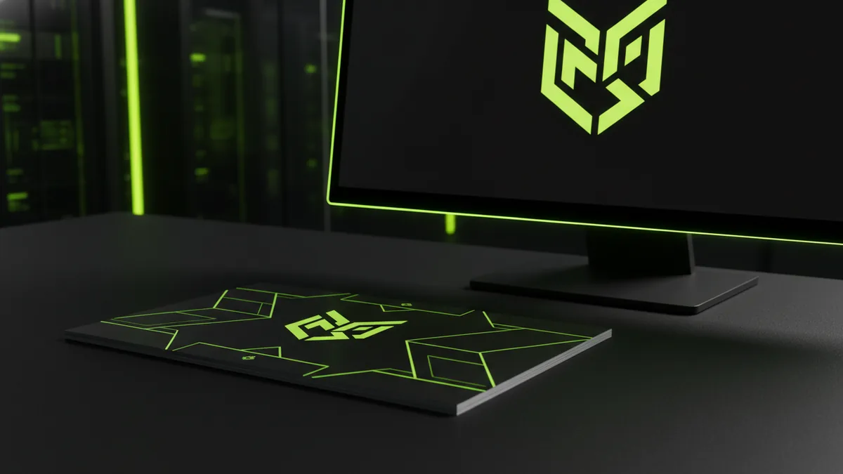
Logo mockups also matter. When you place a logo into a mockup, you are testing visibility. If the logo looks weak in the mockup, it will likely fail in real use. So validate the mark on plain backgrounds and textured ones too.
For people who wonder about editing, note this rule. Don’t rebuild the logo from scratch for each use. Instead, use the approved logo versions from your guidelines. This is the easiest path to consistent brand identity.
Some teams also ask about watermarking images. Watermarking images with your logo can protect content. It can also reinforce brand recognition when your assets are shared. Use a clear opacity level so the logo is visible without distracting from the main content.
| Channel | Common file choice | Why it helps |
|---|---|---|
| Website headers | SVG or high-res PNG | Sharp edges at different sizes |
| Landing graphics | PNG with transparency | Easy layering over backgrounds |
| Print proofs | PDF or EPS | Reliable sizing for layouts |
| Reviews and handoff | Consistent look across devices |
Printing and Merchandise Applications
Print branding is different from screen use. Printers need files built for their workflow. If you send the wrong format, you risk shifts in size and color. That breaks the “recognition” part of brand identity.
For business cards and stationery, use vector files when possible. EPS or PDF often fits common print pipelines. If you must use raster art, export at a high resolution. Then test a hard copy proof before mass printing.
For merchandise, plan for production limits. Screen printing cannot always handle fine gradients. Embroidery needs simpler shapes. Vinyl decals need clean edges and strong contrast. Your logo versions help here because the right one is already ready.
Also consider how people will hold physical items. A logo that is too small can disappear. A logo with weak contrast can blur in low light. If you can, place the logo on mockups in the same lighting you expect in real life.
If you sell online or run events, tie this back to how to use your logo everywhere. Your business cards, posters, and tags should match your digital header. Then your brand identity looks unified in every context.
- Business cards and letterhead: prefer vector exports
- Posters: verify contrast from distance
- Stickers: ensure edges stay clean at small sizes
- Embroidery: use an icon mark version
Protecting Your Logo Design
Design protection starts with rules. Create a single source of truth for your artwork and files. Keep it inside a shared folder with version history. This reduces “new logo” edits from teammates over time.
Asset control also supports trademark protection. While you should consult a legal pro for filings, basic cleanup matters. Use only approved artwork and avoid unofficial variants. If you allow random edits, you make enforcement harder later.
Now, about font and flag questions people ask. Can i use any font for my logo? You can choose type freely for early drafts. For a final logo, it is best to use fonts you can legally license for the logo. Also keep the letterforms consistent with your brand identity.
Can you use any font for a logo in the strict sense? If you use an unlicensed font, you risk rights issues. If your logo is meant for print and merch, licensing matters even more. When in doubt, use licensed fonts or convert text into vector shapes in final files.
Next, the flag question. Can you use the american flag in a logo? Rules vary by use and local law. If your logo includes flags or specific insignia, seek professional guidance. Even well-meaning uses can create compliance risks.
Finally, tools and creation workflows. If you are learning how to use logo maker workflows, start from a vector-first export plan. If you want how to use inkscape to make a logo, build from shapes and keep clean alignment. If you prefer how to use procreate to make a logo, sketch and refine, then trace into vector for the final mark.
You can also create ratio-based marks. How to make golden ratio logo often means using a grid approach. Use the ratio to place key elements and balance line weights. Then test the logo at sizes that would appear on a favicon and a business card.
If you use other design tools, the same principles apply. When asking how to use logo design studio pro, focus on approved exports and consistent lockups. For how to use logo mockup in photoshop, validate legibility and contrast on both light and dark scenes. Use mockups to test placement, not to redesign the logo.
When teams follow these steps, the brand stays recognizable. That makes your logo an asset, not a repeat task. Use guidelines, keep files organized, and treat your logo like a system.
- Use one source of truth for logo files and versions
- Keep fonts licensed and lock down final vector artwork
- Test usage at small sizes and real backgrounds
- Seek guidance if your logo uses flags or protected marks
Frequently asked questions
- How do I use a logo on my website without it looking blurry?
- Use SVG when possible, or export high-res PNG for crisp edges. Also test the smallest size in your header so legibility stays consistent.
- What are the best logo files and formats for web and print?
- Use SVG for scaling on the web. Use PNG for transparent layers, EPS for many print workflows, and PDF for proofs and sharing.
- How do I set logo usage guidelines for spacing and color?
- Define clear space around the logo using a logo-based unit. Document allowed colors and list banned edits like stretch, outlines, or shadows.
- Can I use any font for my logo?
- You can use any font for drafts, but you must license it for logo use. For final delivery, convert text to vector shapes when needed.
- Can you use the American flag in a logo?
- It depends on the context and applicable rules. If you plan to include it, ask a qualified professional before finalizing.
- How do I use logo mockups in Photoshop correctly?
- Use mockups to test size, contrast, and placement. Do not redraw the logo in the mockup file; use the approved logo versions instead.
Related reading

How to Make a Clothing Brand Logo That Fits Your Brand
Learn how to make a clothing brand logo that looks sharp, fits your style, and tests well.
How to Create and Place a Logo on Letterhead
Get logo sizing and placement tips for a professional letterhead.

How to Come Up With a Good Logo Design
A step-by-step logo process: identity, inspiration, competitors, style, color, and testing.