How to Put a Logo on Letterhead (Placement + Design)
Learn how to create a letterhead with logo. Get placement rules, logo sizing, color theory, and design elements for professional branding.
Understanding letterhead design
A letterhead is the top portion of business stationery that identifies your company. It usually includes your logo, business name, address, and contact details. Many letters also add a tagline or website URL.
The purpose is simple: make every business communication look consistent. When the layout stays stable, recipients trust the message more. A letterhead is part design, part business communication.
In practice, a letterhead lives in two formats. It appears in print on headed paper and in digital PDFs for email attachments. The design needs to hold up in both, with clear spacing and readable text.
- Print needs crisp lines and safe margins.
- Digital needs legible type at screen sizes.
- Both need a consistent brand identity.
Why the logo belongs on your letterhead
Your logo is the fastest brand signal on the page. It helps people recognize your company before they read a single line. That recognition supports brand identity across proposals, invoices, and letters.
Without a logo, a letter can look like a generic template. That often reduces perceived quality, especially for first-time recipients. With a logo, you also make your business feel stable and organized.
A logo on a letterhead also acts as a design anchor. It gives the rest of the template a focal point and helps typography and color feel intentional. This is where professional design meets practical business communication.
| Letterhead element | What it does | Why it matters |
|---|---|---|
| Logo | Identifies the brand | Improves recall and trust |
| Company name | Reinforces identity | Helps scanning and search |
| Contact block | Enables action | Reduces back-and-forth |
Steps to create a logo suitable for letterhead use
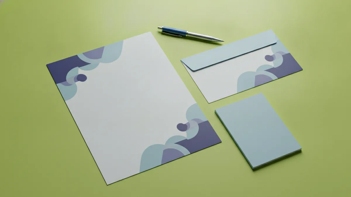
If you are asking how to create logo for letterhead, start by confirming the logo format you will use. Letterheads often need both screen and print results. Aim for vector artwork so the logo stays sharp at any size.
Next, choose a simplified version for stationery. Many logos have small details that disappear when scaled down. Create a “letterhead lockup” that keeps the brand mark clear and readable.
When you how to make letterhead with logo, you also need design-ready file sizes. Export your final logo as SVG and PNG. Keep the SVG for future edits and the PNG for quick placement in common tools.
- Collect source files. Use your original vector file if you have it. If not, rebuild from trusted references or request an agency export.
- Check readability at small sizes. View the logo at 20–30 mm wide for print. If text becomes fuzzy, simplify shapes.
- Create a horizontal and a stacked lockup. Letterheads vary in width. You may need a stacked version for narrow margins.
- Decide on a one-color version. Letterheads may print in grayscale. Test a single-color logo for visibility and contrast.
- Export for common uses. Export SVG, and export PNG at 300 dpi for print. For digital mockups, also export a web PNG.
Design considerations matter more than most people expect. Keep stroke weights bold enough for office printers. Avoid ultra-thin lines and tiny fine details that vanish on cheap paper.
Best practices for logo placement on a letterhead
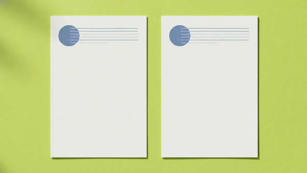
The most common question is where does logo go on letterhead. In most business formats, the logo sits in the top header area. Place it in the upper-left region for left-to-right reading habits.
If you prefer a centered brand look, you can align the logo to the top center. But be consistent with the rest of your header grid. Do not mix center alignment for the logo and left alignment for the contact block unless the layout is intentionally styled.
For where to put logo on letterhead, use a simple rule: balance the header. If your logo is wide, keep the contact details on the right. If your logo is stacked, position it on the left and give contact details more vertical space.
- Top margin: Keep clear space above the logo. Many letterheads look best with 15–25 mm.
- Left padding: Use the same horizontal padding as your body text.
- Logo size: Target roughly 35–60 mm wide for standard A4 headers.
- Clear separation: Leave a gap between the header and the first paragraph.
Positioning gets easier when you use a letterhead template. Build a grid first. Then align the logo, company name, and contact block to that grid.
Practical placement examples
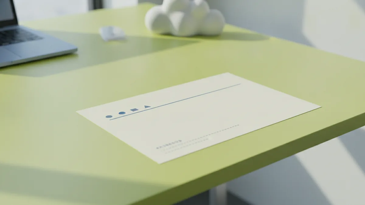
Example one: typical professional layout. Put the logo top-left at about 45 mm wide. Put the company name and contact details top-right in a neat block.
Example two: minimalist layout. Center the logo top-center. Keep the contact details below it, still within the header area.
Example three: legal or formal tone. Use the top-left logo. Add a thin rule line across the page width to separate header and content.
Choosing fonts and colors for logo visibility
Color theory helps your logo do its job on stationery. Your logo colors should contrast with the paper tone. If your background is off-white, test the logo against that exact shade.
Two-color palettes work well for business communication. They keep the design focused and avoid visual noise. Use brand colors for the logo and one supporting accent color for small elements like rules or section headers.
Typography also affects how polished your letterhead feels. Pair a clean font for body text with a strong choice for headings or the company name line. Good typography improves scanning and makes the document easier to read.
| Goal | Color approach | Font approach |
|---|---|---|
| Keep it professional | Use brand color for logo and rules | Choose a readable sans or serif |
| Improve contrast | Test grayscale and off-white paper | Use medium weight for headings |
| Stay consistent | Limit accents to one color | Use one family with two weights |
If you want a quick method, pick one primary ink color and one support color. Then set rules and small UI-like lines using the support color. Do not use more than two or three distinct colors total.
Color and print reality checks
Most offices print with different ink settings than your screen. Always check a grayscale version of the logo. If the logo loses shape in grayscale, increase contrast or adjust hues.
Also test on the paper you will actually use. Coated and uncoated stocks can shift perceived brightness. Your logo should remain legible under those conditions.
Additional design elements for stronger letterheads
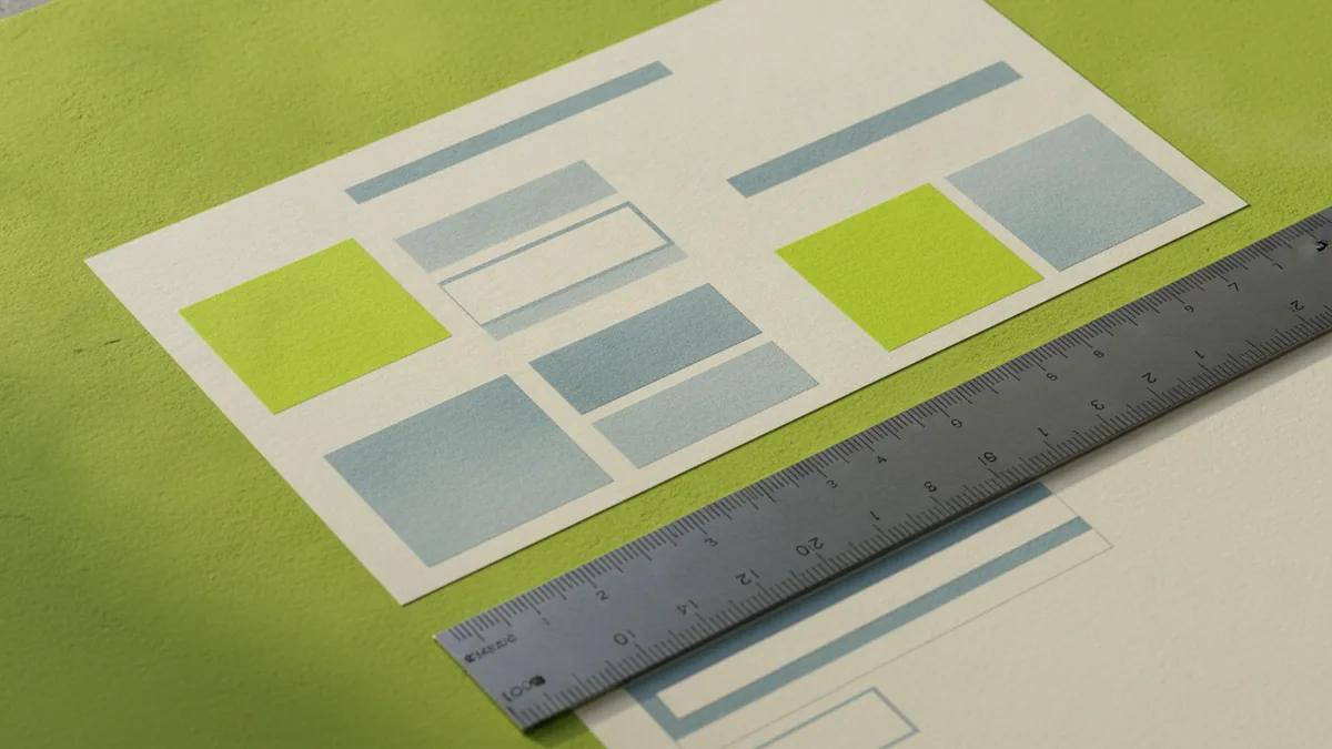
Complementary elements can make a letterhead feel complete. The key is subtlety. You want support for the content, not decoration that competes with the message.
Consider a thin horizontal rule under the header. It creates structure and makes the first paragraph easier to find. Use the line in your accent color or a darker gray for a clean look.
You can also add a small “branding moment” like a footer icon or a second line of company details. Keep it within a predictable margin. Overbuilding the header reduces readability.
- Header rule line: 0.25–0.75 pt weight for most print styles.
- Footer contact: Repeat phone or website in the bottom area.
- Document metadata: Add a reference number field when needed.
- Whitespace: Use consistent spacing so the page breathes.
If you send proposals, match the letterhead style to your cover page. The letterhead template should connect to the broader brand identity. Consistency reduces the “assembled from parts” look.
Build a letterhead template you can reuse
When you how to make letterhead with logo, build once and reuse often. Create a template with locked header regions. Then reuse it for DOCX, Google Docs, InDesign, or PDF exports.
This is where good graphic design process shows. Your team should be able to drop in content without breaking alignment. If you do not lock layout spacing, later edits can shift your logo and contact block.
Conclusion and resources
A strong letterhead comes down to three choices. You need a logo that remains readable, a placement that balances the header, and a design system for fonts and color. Once those are set, creating documents becomes faster and more consistent.
Use these steps as a baseline. Then test your result in print and as a PDF. Small tweaks to size, margins, and contrast often deliver the biggest jump in perceived quality.
For tools, many teams start with vector editors for the logo and a layout tool for the letterhead template. If you want accessible web-friendly options, look for tools that support SVG and PDF export. This makes it easier to keep your branding consistent.
Helpful software and file formats
- Vector design: SVG support is ideal for logos.
- Layout and templates: choose tools that export clean PDFs.
- Color testing: confirm grayscale and off-white paper versions.
- File handoff: keep editable sources plus export-ready assets.
If you need a starting point for accessibility-aware color checks, the W3C provides guidance on contrast. You can use that as a reference when tuning your letterhead for readability. minimum contrast requirements can help you avoid low-contrast color combos.
Finally, keep your letterhead practical. A beautiful header that pushes body text down or reduces readability will hurt communication. Aim for clarity first, then polish with measured accents.
Frequently asked questions
- What is a letterhead and why do businesses use it?
- A letterhead is a branded header on business stationery. It helps recipients recognize your company and keeps documents looking consistent.
- Where does the logo go on a letterhead?
- Most letterheads place the logo in the top header area, usually top-left. A top-center logo can work if the contact block aligns consistently.
- How do I create a logo for letterhead use?
- Create a simplified lockup that stays readable when small. Use vector artwork and export one-color and grayscale-ready versions.
- Where to put logo on letterhead for best visual balance?
- Place the logo where it balances the header content. If your logo is wide, put contact details on the opposite side.
- How do I make a letterhead with logo in common tools?
- Start with a reusable template and lock the header spacing. Import your logo as SVG or high-quality PNG, then keep alignment on a grid.
- What color choices make logos look good on letterhead?
- Use brand colors with good contrast against the paper. Test your logo in grayscale and on the actual paper stock before finalizing.
Related reading

How to Come Up With a Good Logo Design
A step-by-step logo process: identity, inspiration, competitors, style, color, and testing.
How to Make a Logo Online for Free: Tools, Tips, Downloads
Make a custom logo online for free. Learn tools, template edits, and smart export tips for web and print.

How to Build a Logo: Steps, Tools, and Testing
A practical guide to how to build a logo—steps, tools, and logo testing.