How to Come Up With a Good Logo Design (Process Guide)
Learn a practical process for creating a logo: brand values, inspiration, competitor research, style, color, and testing so it fits your business.
Why a logo matters more than you think
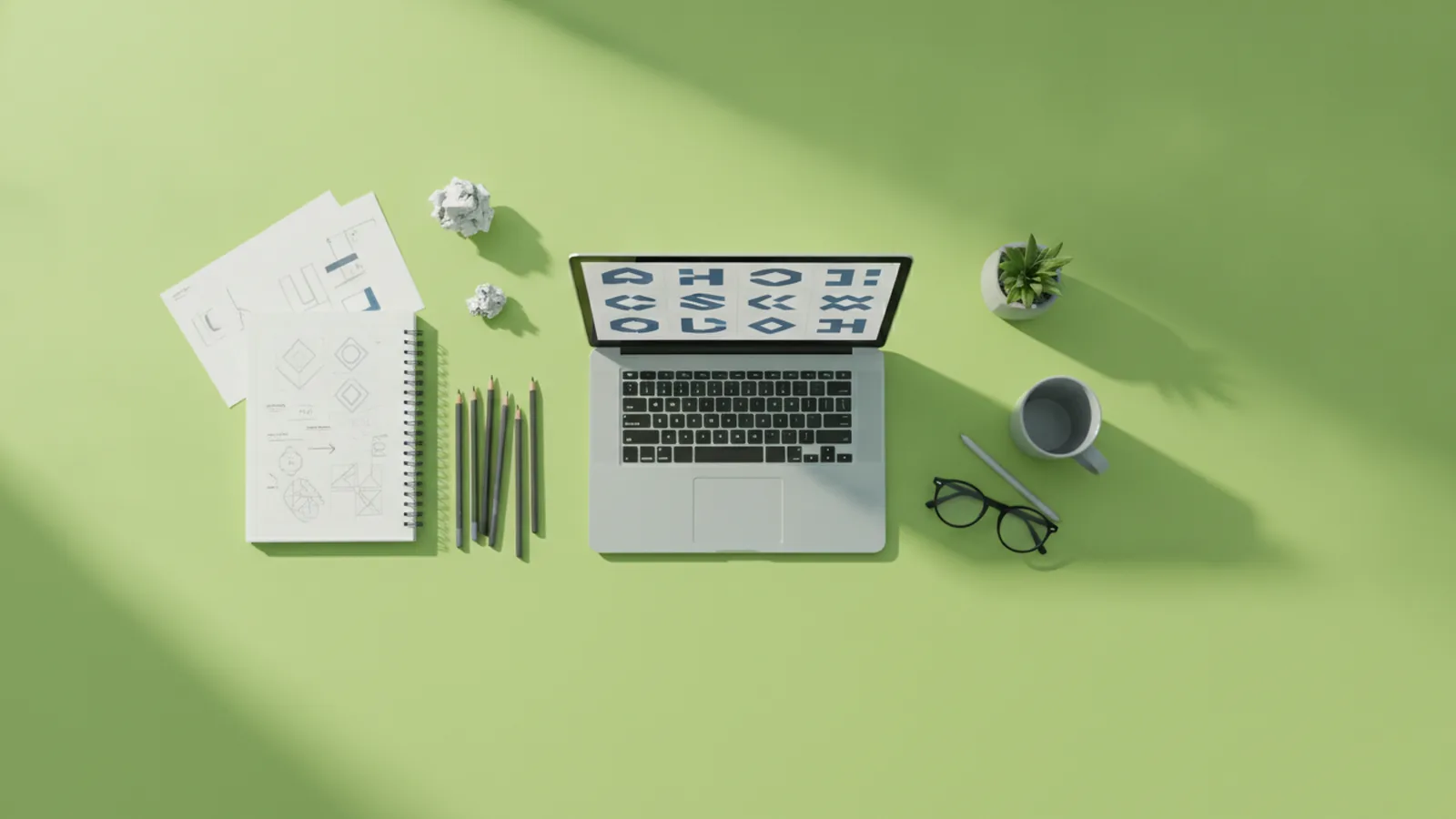
A logo is often the first impression customers have of your business. It shows up on your site header, ads, packaging, and social profiles. Because it is visible everywhere, it shapes trust and recall from day one.
A strong logo also makes your brand identity easier to recognize. People do not just remember what you sell. They remember the look and feel that comes with it. That is why learning how to come up with a good logo is not just design work. It is brand work.
In practice, a logo helps you stay consistent as you grow. When you have clear visual rules, your marketing looks more coherent. It also speeds up future design decisions for new pages, campaigns, and product updates.
- Recognition: Consistent visual cues help customers spot you fast.
- Trust: Clean design signals care and professionalism.
- Differentiation: A distinct mark prevents “looks the same” confusion.

Define your brand identity before you sketch anything
Before you start learning how to come up with a good business logo, define what your business stands for. Start with your core values and translate them into plain language. For example, “reliable” might become “steady,” “calm,” or “carefully built.”
Next, clarify your target customers and how they make decisions. Are they buying on emotion, speed, price, or expertise? If you know what they care about, you can choose visual elements that match their expectations.
Then write a short brand story. Use three sentences: what you do, who you do it for, and why you do it better. This becomes your “design brief” when you later test fonts, colors, and symbols.
- List core values (5 to 7) and define each in one line.
- Describe your audience and what they want to feel.
- Write a brand story in three sentences.
- Pick one key message your logo should communicate.
Use smart logo inspiration to generate real ideas
Logo inspiration is not about copying others. It is about collecting directions you can adapt to your brand. When people ask how to come up with a good logo design, this step is usually where quality starts.
Try a simple inspiration sprint. Set a timer for 30 minutes and gather references that match each part of your brand story. Save examples for shapes, typography, icon styles, and layout. You are building a mood board that you can reference when ideas stall.
Use brainstorming techniques to widen the idea pool. Start with word-to-visual mapping, then build variations fast. If you only brainstorm one concept, you limit your options too early.
- Word mapping: Convert values into visual ideas (e.g., “speed” → motion lines).
- Material cues: Think of surfaces your brand feels like (metal, paper, glass).
- Shape associations: Curves can feel friendly, angles can feel bold.
- Logo types: Explore icon, wordmark, monogram, and combination marks.
Research competitors to differentiate without blending in
Competitor analysis is how you avoid designing a logo that looks like everyone else. Look at what direct competitors use on their websites, packaging, and ads. Note common patterns such as icon style, color palettes, and typography choices.
Do not just list similarities. Identify what those similarities imply about the market. If most logos in your niche use dark colors and condensed fonts, customers may expect a certain tone. Your differentiation can be subtle, but it should still be clear.
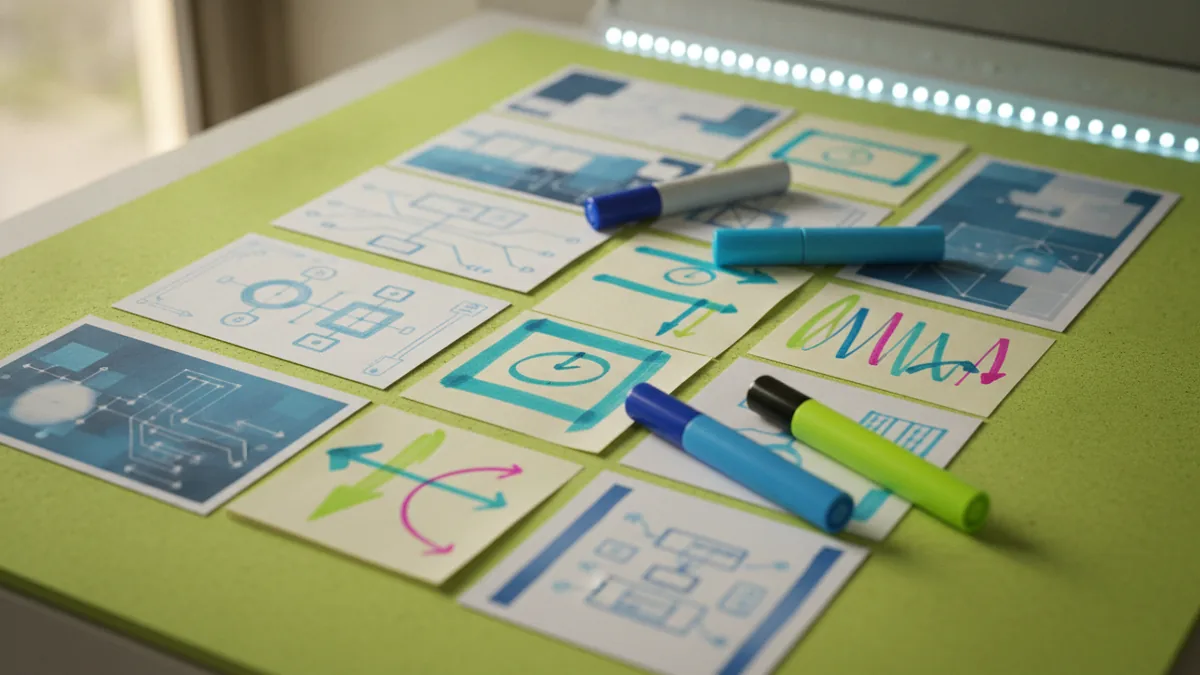
A good approach is a “contrast map.” On paper, choose three competitor logos and write down what they do well. Then write how you can offer a distinct angle that still fits your category.
| What you see | How it feels | Your opportunity |
|---|---|---|
| Similar icons | Familiar but generic | Use a new symbol concept tied to your brand story |
| Same color range | Expected tone | Shift hue or value while keeping readability |
| Typography pattern | Same personality | Pick a different font voice that fits your values |
Choose a design style that fits your brand personality
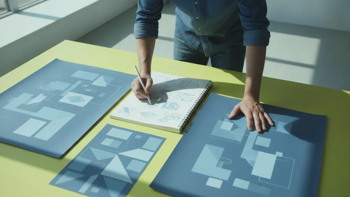
Deciding on a design style helps you stay focused when choices multiply. Common design style options include classic, modern, vintage, and playful. Each one carries expectations, so match the style to what your customers want to believe.
A classic style often feels dependable and timeless. A modern style can feel efficient and forward-looking. A vintage style can suggest heritage or craftsmanship. A playful style works well for friendly brands, especially when your product is easy to try.
As you choose, think about where the logo must work. It needs to look right on dark and light backgrounds. It also needs to remain clear at small sizes, like favicons and social avatars.
- Classic: Balanced spacing, restrained shapes, sturdy typography.
- Modern: Clean geometry, fewer visual elements, confident contrast.
- Vintage: Texture cues, historic proportions, warmer palettes.
- Playful: Rounded forms, expressive rhythm, softer edges.
Select colors and fonts using color psychology and clarity rules
Color psychology can enhance the emotional impact of a logo. But it works best when you use it with intent, not guesswork. Start from how you want customers to feel when they see your brand.
For example, many brands use blue to suggest trust and calm. Green is often associated with growth or freshness. Warm colors like orange can feel energetic and approachable. Still, the same color can mean different things in different cultures, so sanity-check with real audience feedback.
Fonts carry a similar job. A bold typeface can signal confidence. A thin serif can imply tradition and detail. A rounded sans can feel friendly and accessible. Choose a font voice that matches the design style you picked earlier.
Finally, set practical constraints. Pick a primary color plus one supporting color. Choose a font family you can use across your site and marketing assets. Make sure the logo remains readable in one-color versions.
- Pick 1 primary color and 1 accent color.
- Test contrast on white and dark backgrounds.
- Choose 1 font voice that matches your style.
- Verify small-size legibility at thumbnail scale.
Test, refine, and iterate until the logo earns trust
Even the best first draft is rarely the final logo. Iteration is how you turn early sketches into a confident mark. When you learn how to come up with a good logo, you also learn how to improve it after feedback.
Start with fast sketches. If you can produce 20 to 30 variations quickly, you increase your odds of finding a strong direction. Then refine the top two or three into more finished concepts. This “diverge then converge” workflow helps you avoid spending hours on the wrong idea.
Next, collect design feedback from people who understand your customers. Ask what they notice first and what they assume your brand does. If multiple people misunderstand the message, you need to adjust visual elements like symbol clarity, spacing, or typography weight.
Use a testing checklist that focuses on real-world use. Your logo must work in one color, small size, and different layouts. Test it on mock placements such as website headers and social profile crops. This is how design feedback turns into concrete fixes.
- One-color test: Can it still be recognized with no color?
- Small-size test: Does it stay readable at 32 pixels?
- Layout test: Does it fit left-aligned and centered use?
- Meaning test: Do people guess the right industry?
Build a repeatable logo process for future updates
Once your logo is approved, lock in the rules that keep it consistent. Define clear usage for spacing, color values, and minimum sizes. This prevents future “quick fixes” from slowly damaging the brand look.
You should also document the logo variants you need. Most businesses need a horizontal version and a stacked version. Many also need a simplified icon for small placements where the full wordmark does not fit.
If you ever refresh the brand later, you will already have a strong foundation. You can evolve the mark without losing recognition. That is the real payoff of a thoughtful design process.
For web businesses, this matters even more because your logo appears across UI elements. When you plan for consistency early, your future development stays simpler.
Common questions about creating a good logo
Frequently asked questions
- How do I come up with a good logo for my business?
- Start by defining your values, audience, and key message. Then sketch multiple directions, test them for clarity, and refine using feedback.
- What’s the best way to come up with a good logo design?
- Use a diverge-then-converge workflow. Generate many rough ideas, narrow to the top options, and iterate on color, type, and symbol.
- How do I know my logo design style matches my brand?
- Match the style to the feelings your customers expect. Also test how the logo looks in real placements and at small sizes.
- What role does color psychology play in a logo?
- Color psychology helps you choose emotions your logo should trigger. Keep your choices grounded in readability and consistency across backgrounds.
- How do I use competitor analysis when creating a logo?
- Look for repeated patterns in color, icon style, and typography. Then build a contrast map to find a distinct direction for your brand.
- How many iterations should I expect before my logo is ready?
- Plan for multiple rounds. Many teams refine 2 to 3 top concepts after initial sketches, guided by clear design feedback.
Related reading
How to Create and Place a Logo on Letterhead
Get logo sizing and placement tips for a professional letterhead.
How to Make a Logo Online for Free: Tools, Tips, Downloads
Make a custom logo online for free. Learn tools, template edits, and smart export tips for web and print.

How to Build a Logo: Steps, Tools, and Testing
A practical guide to how to build a logo—steps, tools, and logo testing.