How to Build a Logo: Steps, Tools, and Testing
Learn how to build a logo with clear steps, design tools, and testing tips. Build a brand logo people recognize in any size.
Understanding logo design (and why it matters)
A good logo helps people spot your brand fast. It also shapes trust because it becomes the first visual cue in ads, email, and product pages. When your logo feels steady and clear, customers expect your business to be steady too.
Before you touch any design tool, learn what the logo must do for your company. Start with your brand identity goals and the message you want to signal. Then map those ideas to a target audience who will actually see and judge the logo.
Design principles guide this work, not personal taste alone. Think about visual hierarchies, readable typography, and color theory that fits the emotional tone of your industry. Your goal is a symbol and wordmark system that stays consistent across touchpoints.
- First impression: The logo appears everywhere before your message does.
- Brand recall: Simple marks stick in memory.
- Trust signal: A clean design reduces “amateur” assumptions.
Key steps to create a logo
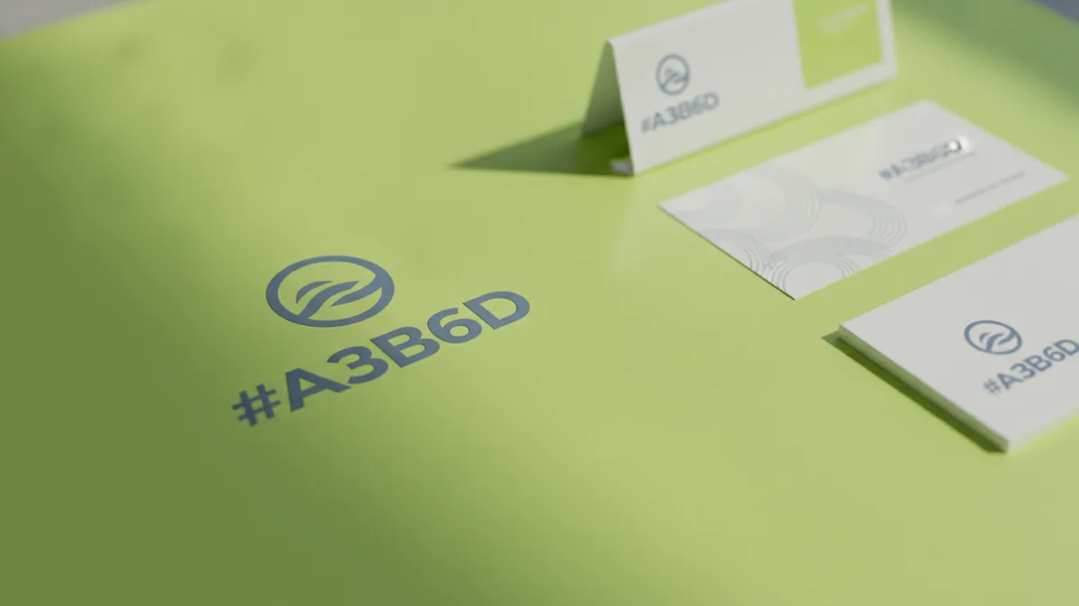
To learn how to build a logo, begin with clarity. Write down your brand values and decide what you want to communicate in plain language. If you cannot explain it in one sentence, you will struggle to design it.
Next, define your target audience and the contexts they care about. A logo for a medical clinic often needs calm and clarity. A logo for a skate brand can use energy and contrast. Your audience should recognize themselves in the style.
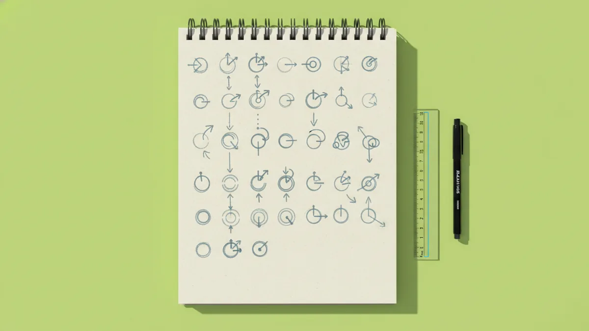
Then generate and test directions early. Sketching ideas on paper is fast and cheap, so you can explore variations without getting attached. Aim for 20 to 30 rough concepts before you pick one direction.
- Define the message: Brand values, audience, and the feeling you want.
- Sketch fast: 20 to 30 rough marks and wordmark combinations.
- Choose a direction: Pick the one that best matches your goals.
- Build a system: Logo, icon, and simple layout rules.
- Test and refine: Check legibility, balance, and usage.
Tools for designing logos (from free to pro)
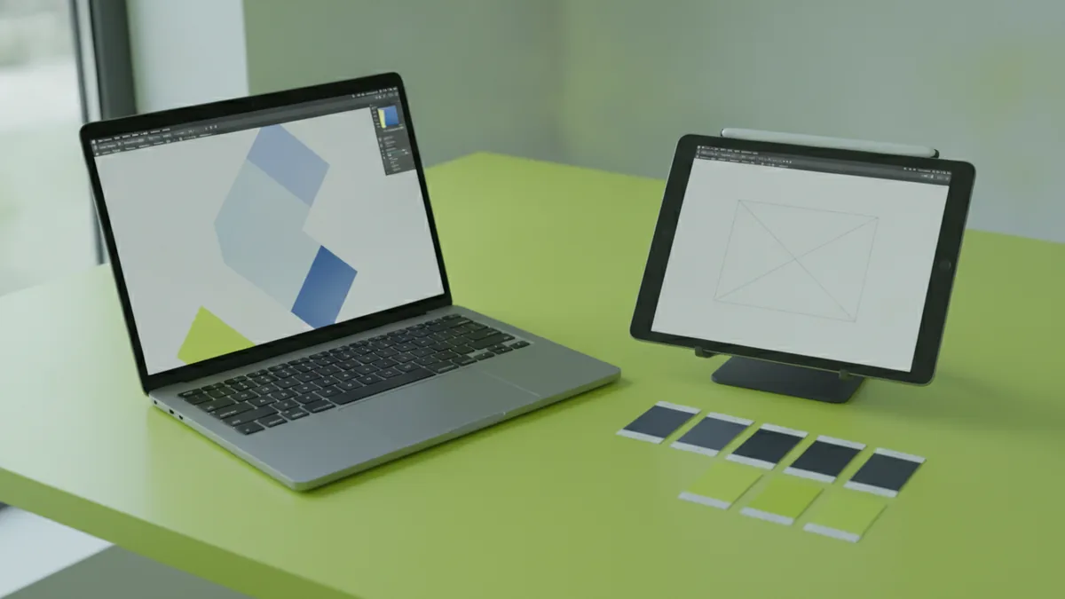
If you want how to build a logo for free, start with Canva and basic vector exports. It is quick for layout experiments, and it helps you learn composition. The tradeoff is that free workflows can lead to tangled files if you do not manage them well.
For how to build your own logo with more control, use vector tools. Programs like Adobe Illustrator are built for crisp shapes that scale without blur. If you are working with raster photos or texture effects, Photoshop can support the background work, but the logo itself should end up as vector art.
When learning how to build a company logo, think in layers and reuse. A common workflow is to design the mark and wordmark separately, then define spacing rules. Keep your color set small so your brand stays consistent.
| Tool | Best for | Watch-outs |
|---|---|---|
| Canva | Quick drafts and simple layouts | Make sure you can export clean vectors |
| Illustrator | Vector logo building and refinements | Start with a clear grid to avoid messy spacing |
| Photoshop | Photo edits or texture prep | Do not “finish” the logo only as pixels |
- Vector first: Design the logo so it scales from favicons to billboards.
- Limit fonts: Use one or two typefaces for the logo system.
- Keep palettes tight: Usually 1 to 3 main colors.
Tips for a professional look
A professional logo feels intentional, not decorative. Keep it simple so it is easy to recognize at a glance. If you cannot describe the mark in one sentence, the design is likely too complex.
Focus on unique shape language, not just a trendy icon. If competitors use similar circles, lines, or mascots, your logo needs a different visual approach. Uniqueness can come from proportions, angles, and negative space.
Typography and color should support each other. If you use a bold display typeface, pick color values that match the energy. If you use a calm serif, choose colors with softer contrast.
Use strong visual hierarchies inside the logo lockup. Often the icon leads, and the brand name follows with consistent spacing. Also ensure readability for small sizes like social avatars and printed receipts.
- Simple shapes: Reduce fine details that disappear when scaled down.
- Consistent spacing: Define padding around the icon and letters.
- Color discipline: Test contrast, not just beauty.
- Scalable layout: Prepare horizontal and stacked options.
If you are learning how to build a brand logo, treat it like a system. The logo includes color rules, type rules, and spacing rules. Those rules are what keep branding consistency when you publish new content.

Common mistakes to avoid
One of the biggest issues in how to build a logo is skipping definition work. If you start with a random icon and a nice font, your logo may look fine but fail to represent your brand values. Your logo should support the message, not distract from it.
Another frequent mistake is copying competitor styles too closely. Even if you change the icon, the overall feel can still be “same category.” Unique marks differentiate your business and help customers choose you faster.
People also over-detail logos. A logo should still work at tiny sizes, where thin lines and complex gradients become muddy. Keep shapes bold enough to survive low resolution.
- Too much detail: Fine lines break in small applications.
- Wrong font pairing: The typography clashes with the brand tone.
- Too many colors: Variations create messy branding consistency.
- No system: One logo file cannot cover every use case.
- No testing: You discover problems only after printing or launching.
Also watch for file issues. If you only export PNGs, you may struggle to update later. If you use editable fonts you do not own, you may lock yourself out of future edits.
Inspiration and examples that guide the process
Inspiration is useful when it turns into design decisions. Instead of saving 50 images, study 5 to 10 logos and note what makes them work. Look at composition, spacing, stroke weight, and the way color supports meaning.
Try building mood boards around your target audience. Collect examples that match the feeling you want, then compare why those designs work. This helps your sketching ideas stay focused when you move into digital design tools.
For example, a modern tech brand often uses clean geometry and strong contrast. A craft food brand may favor warm colors and friendly letterforms. The key is not the industry label, but the design principles behind the style.
- Check legibility: Can you read the name at small sizes?
- Check balance: Does the icon feel weighted like the text?
- Check uniqueness: Do the shapes stand apart from peers?
- Check scalability: Does it work in one-color?
Finalizing and testing your logo
Finalizing is where many people get sloppy. Do logo testing in real contexts so you catch issues early. Check it on a website header, app icon, social profile, business card, and printed flyer.
Test your logo at multiple sizes. A safe minimum rule is to confirm it still reads clearly around 32 pixels. Also test in grayscale and in high-contrast modes to see if color is doing the work you think it is.
Gather feedback, but structure it. Ask reviewers what they understand in two seconds. Then ask whether the icon feels aligned with your brand values and target audience.
When you refine based on feedback, make controlled changes. Adjust spacing, stroke weight, or typography first. Avoid redoing the whole logo unless your direction is clearly wrong.
- Size tests: 32px, 128px, and large display layouts.
- Use tests: light background, dark background, and one-color.
- App tests: favicon size, social avatar crop, and mobile header.
- Feedback loop: two-second impressions and clarity checks.
If you are asking how to build a logo for your business, treat this stage like a launch checklist. You should end with export-ready assets and clear rules for branding consistency.
Frequently asked questions
- How do I build a logo step by step?
- Define your brand values and audience first. Sketch many directions, pick one direction, then build it in a vector tool. Test it at small and large sizes and refine using clear feedback.
- How can I build a logo for free?
- Use a free design tool to draft layouts and explore type pairings. Export clean assets, and make sure the final logo can scale as a vector, not only as a raster file.
- How do I build a company logo that looks professional?
- Use simple shapes, strong spacing, and readable typography. Create both horizontal and stacked lockups. Then test it on business cards, icons, and website headers.
- How do I build my own logo in Illustrator or Photoshop?
- In Illustrator, build the mark and wordmark as vectors with consistent spacing rules. Use Photoshop only for supporting assets like background textures, not as your final logo format.
- How do I build a brand logo that is unique?
- Avoid copying competitor composition styles. Create a distinct shape language with your own proportions and negative space choices. Validate uniqueness by comparing your top concepts to peers.
- What logo testing should I do before launching?
- Check legibility at small sizes like 32px. Test one-color and grayscale versions. Also verify the logo works in common real placements like social avatars and print labels.
Related reading
How to Make a Logo Online for Free: Tools, Tips, Downloads
Make a custom logo online for free. Learn tools, template edits, and smart export tips for web and print.
How to Create a Professional Logo for Free Online
Create a professional logo free online. Use templates, customize fonts and colors, then download high-res files.

How to Price Logo Design Services: Costs, Models & Client Fit
Set logo design prices with ranges, models, and client-ready deliverables.