How to Make a Clothing Brand Logo (Step-by-Step Guide)
Learn how to make a clothing brand logo. Get clear steps on identity, color, type, tools, testing, and revisions for a logo that sells.
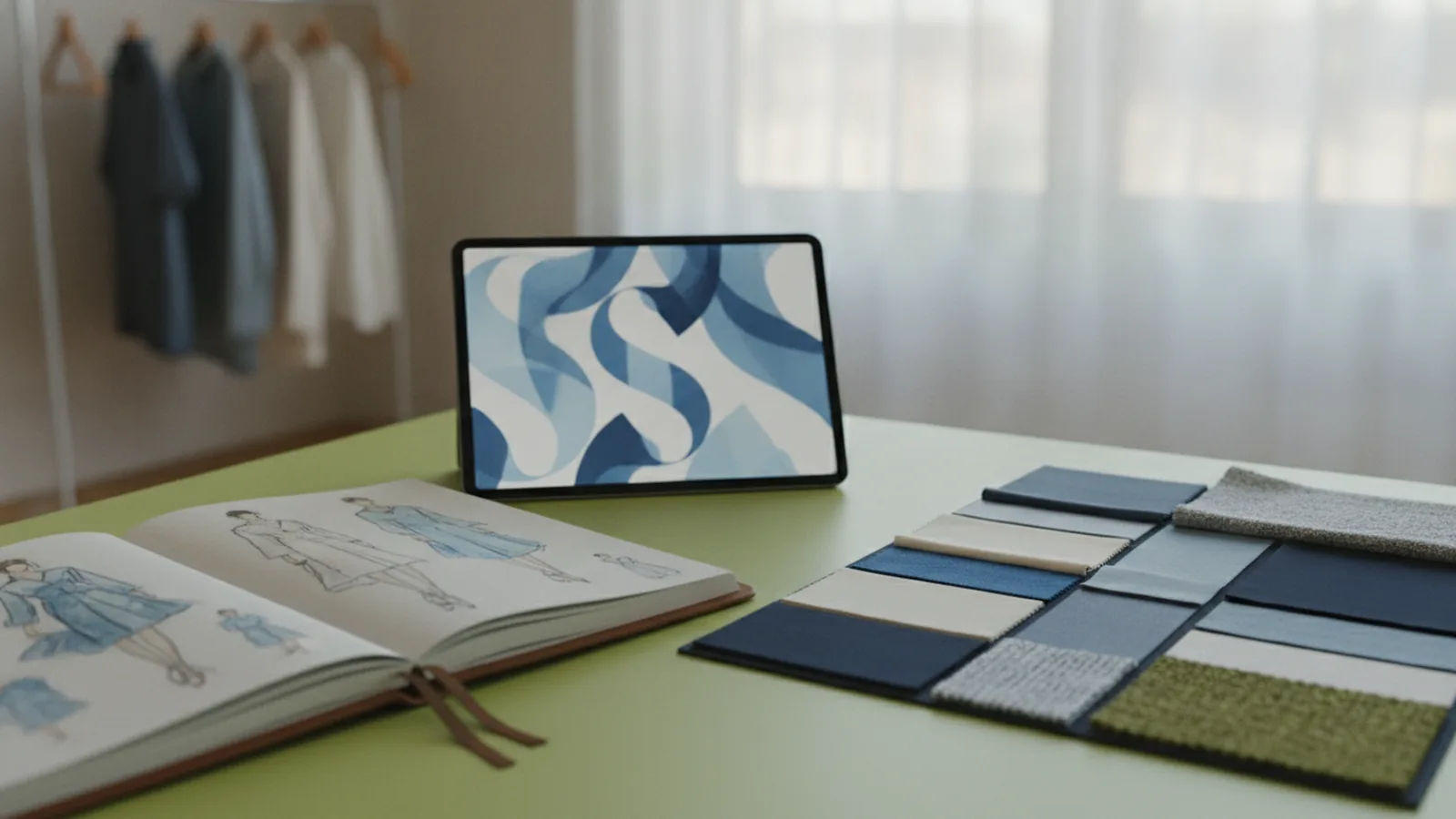
Start with a clear plan: make a clothing logo that feels like your brand
If you want to learn how to make a clothing brand logo, start by designing for identity first, then for style. A good logo is a visual representation of your brand’s identity and values. It should help shoppers recognize you fast, even when they see your mark on a hat, tag, or website header.
To make this practical, you’ll move through a simple flow. Define what you stand for, pick colors and typography that match, then build a few logo options. After that, you test with people who match your target audience and iterate using real feedback.
As you work, aim for a logo that is simple, memorable, and versatile. Those traits matter because your logo needs to survive small sizes, busy backgrounds, and fast online scrolling. A strong mark also stays consistent across branding, product shots, and social posts.
1) Understand logo design basics (so you don’t overcomplicate it)
Before you design anything, understand the basic jobs a logo must do. A logo identifies your brand, signals quality, and helps people remember you. In many clothing categories, it also communicates vibe and status, even before someone reads the product description.
Successful logos are usually simple and repeatable. If you need a magnifying glass to see the details, you will lose impact on small labels. If the shape only works in one color, it won’t be versatile enough for prints, embroidery, or web use.
Think about where your logo will appear. Common spots include garment labels, hang tags, shipping boxes, Instagram thumbnails, and your website favicon. Plan for those realities early, and your later design work gets easier.
- Legibility: readable at small sizes and in grayscale.
- Memorability: a shape or symbol people can recall after one glance.
- Versatility: works in one color, two colors, and full color.
- Consistency: same feel across your brand assets and layouts.
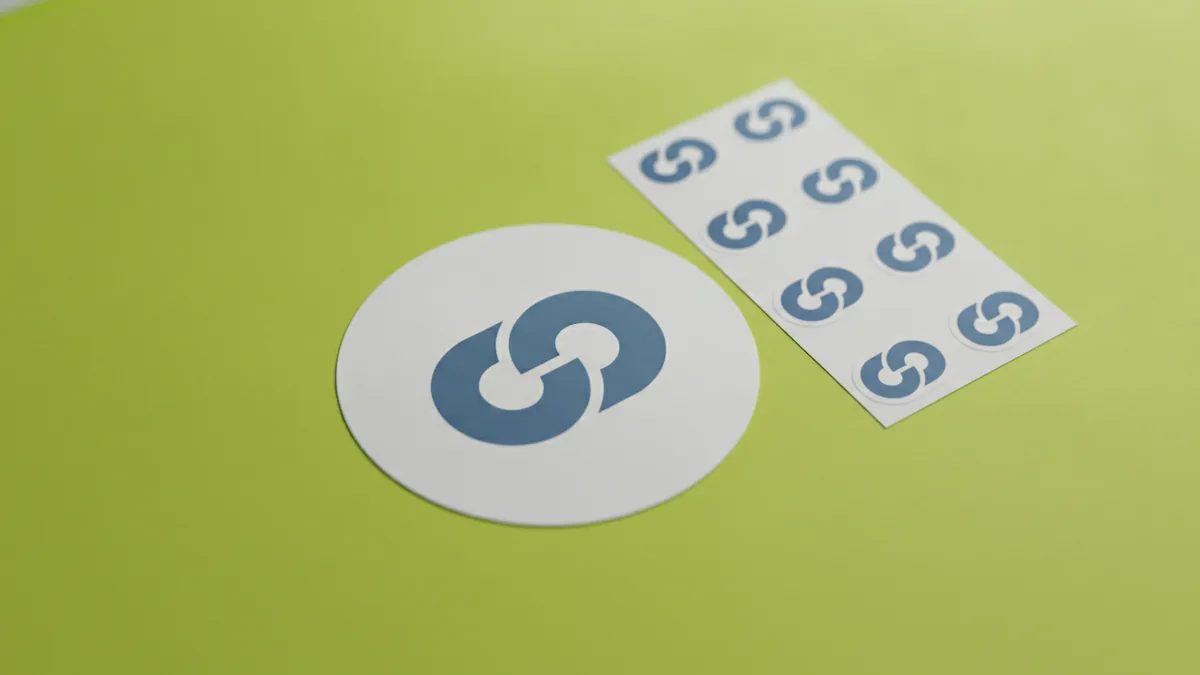
2) Identify your brand identity before you touch fonts or colors
When people search how to make a clothing logo, they often jump straight to graphic design software. That’s a common mistake. Your logo should come from branding decisions first, not from random style trends.
Start with market research and honest answers. Who is your target audience, and what do they care about? Are they chasing comfort, performance, street style, heritage, or sustainability claims? If you can describe their priorities in plain language, your logo choices will follow.
Now translate identity into design direction. Make a short list of brand values, then match each value to a design attribute. For example, “premium” can feel refined with clean spacing, while “rebellious” can feel bold through strong geometry.
- Write 3 brand values in simple words.
- Write 3 adjectives for how your clothing feels.
- List 5 competitors and note what you like and dislike.
- Pick one clear “logo role,” like identity mark or fashion badge.
When you ask how to come up with a clothing brand logo, this step is the answer. Your best ideas usually appear once your audience and values are specific.
3) Choose color schemes and fonts using color theory and typography
Color theory and typography are crucial because they shape first impressions. Color can signal mood, while typography signals personality and readability. When you choose well, people feel the brand before they understand it.
Pick a small set of colors. Many clothing brands succeed with one primary color and one accent, plus black and white for flexibility. You also want colors that hold up under common printing methods like heat transfer and screen printing.
Next, select a type style that matches your visual identity. A minimal sans-serif can fit modern streetwear. A condensed display font can fit bold fashion statements. If you plan to use your logo on small tags, prioritize typography that stays clear at 12–16 pixels.
| Brand vibe | Color direction | Type direction |
|---|---|---|
| Clean and modern | Black, white, cool gray | Geometric sans-serif |
| Classic and heritage | Deep navy, cream, gold accents | Serif with strong contrast |
| Bold and street | Vivid accent plus neutral base | Condensed sans or block style |
| Outdoor and rugged | Forest green, brown, muted tones | Sturdy lettering style |
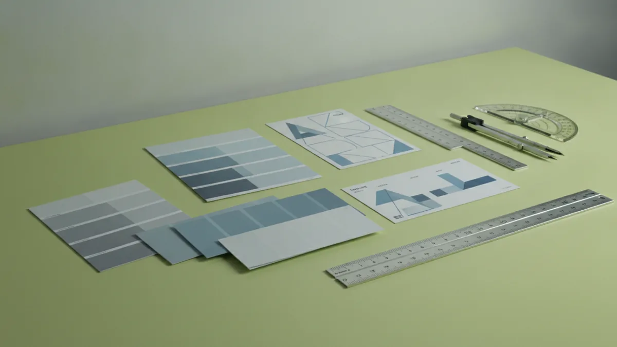
4) Use online design tools and software, or hire help
You have two solid paths for how to make your own clothing brand logo. You can use online design tools or you can hire a professional graphic designer. Either way, the key is output quality, not just speed.
Online design tools help when you want to test ideas quickly. Look for tools that support vector exports, because logos need to scale cleanly from tiny labels to large signs. If a tool only exports raster images, your logo may blur later.
If you hire a designer, give them your brand identity notes and competitor references. A good designer can turn your direction into multiple concepts and refined versions. That approach can save you time when you need a polished visual identity package for launch.
- Use vector software or export to vector (so your logo scales).
- Create variations: full logo, icon-only, and stacked versions.
- Set rules for spacing, stroke thickness, and minimum sizes.
- Plan for monochrome so your logo works in one ink.
For many founders, the fastest process is hybrid. Generate first drafts with online design tools, then refine the best concept. If you care about long-term brand consistency, add a designer review before you print.
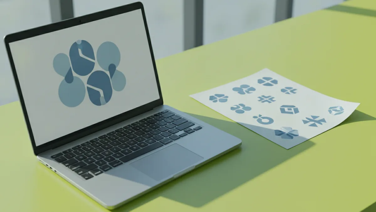
5) Test your logo with your target audience before you finalize it
Testing is where how to make your own clothing brand logo stops being guesswork. You want validation from potential customers, not only from friends. Friends often like what is familiar, even if it doesn’t match your market.
Collect feedback with a clear method. Show your logo options alongside a short description of your clothing style and price range. Ask what people think your brand sells, what vibe they get, and if the logo feels trustworthy.
Use simple questions that reveal confusion. If multiple people say they can’t read the mark, your typography needs work. If they misread your brand vibe, your color or symbol direction may be off.
- Show 2–3 logo options to 10–20 target customers.
- Ask what they think the brand sells and feels like.
- Ask which option they would wear and why.
- Ask about recognition after seeing it for 5 seconds.
Also test real-world use. Place the logo on label mockups, a simple product thumbnail, and a plain background. This checks logo versatility, especially at small sizes.
6) Iterate based on feedback until the logo resonates
Design feedback is only useful when you convert it into decisions. Iteration means you keep what works, then fix what fails. Successful branding is rarely a one-shot logo reveal.
Start by sorting feedback into buckets. Some comments are preferences, like “I like blue better.” Others are functional problems, like “I can’t tell what it is.” Fix functional issues first, because they impact legibility and repeat use.
Then refine your system. Tighten spacing, adjust font weight, and simplify shapes if they look busy. Make sure your logo still works when reduced and when printed in one color.
- Legibility fixes: enlarge small details and improve contrast.
- Identity fixes: align the symbol with brand values and vibe.
- Versatility fixes: test one-color and grayscale versions.
- Consistency fixes: keep rules for spacing and alignment.
Once you reach a version that matches your audience and holds up everywhere, finalize your assets. Export vector files, plus high-quality PNG versions for web. Create a short usage guide so everyone uses the same logo look.
Logo file checklist for launch (so your branding stays consistent)
Even if you already made a clothing logo, you may still get stuck at launch. That happens when files are missing or export settings are inconsistent. A quick file setup prevents delays when you move to printing and marketing.
Make sure you have the right outputs ready before you order tags or start ads. Also confirm that you have the right variants for different placements.
| Asset | Why you need it |
|---|---|
| Vector master (SVG/EPS/PDF) | Scales for labels, embroidery, and signage. |
| Full-color PNG | Looks crisp for website and social posts. |
| Black and white PNG | Works for stamps, mono prints, and low-cost methods. |
| Icon-only version | Fits favicons, app-like avatars, and small tags. |
| Horizontal and stacked layouts | Supports different packaging and page headers. |
With those files, your visual identity stays stable across every touchpoint. That stability is what makes branding feel professional.
Frequently asked questions
- What makes a clothing brand logo effective?
- A strong logo represents your brand identity and values. It stays simple, memorable, and readable across many uses.
- How do I make a clothing logo that stands out?
- Start from your brand identity and audience, then choose colors and type that match the vibe. Test a few variations to see what people understand and remember.
- How do I make my own clothing brand logo without design experience?
- Use online design tools to draft a few concepts and export vector files. Then improve the best option with feedback from potential customers.
- What color scheme should I use for a clothing logo?
- Pick a small set of colors that match your mood and work in grayscale. Make sure the logo still looks clear in one color for prints and tags.
- How do I come up with a clothing brand logo idea fast?
- Write your brand values and describe your target audience in plain words. Then map those words to a style direction for shapes, type, and color.
- How many logo iterations should I do before launching?
- Do at least one round based on target-audience feedback, then refine the top option. If feedback shows confusion, iterate again until the message is clear.
Related reading
How to Create and Place a Logo on Letterhead
Get logo sizing and placement tips for a professional letterhead.

How to Come Up With a Good Logo Design
A step-by-step logo process: identity, inspiration, competitors, style, color, and testing.
How to Make a Logo Online for Free: Tools, Tips, Downloads
Make a custom logo online for free. Learn tools, template edits, and smart export tips for web and print.