How to Make a Cute Logo: Design Steps & Tips
Learn how to make a cute logo with simple shapes, charm-focused colors, and friendly typography. Includes tools, steps, and examples.
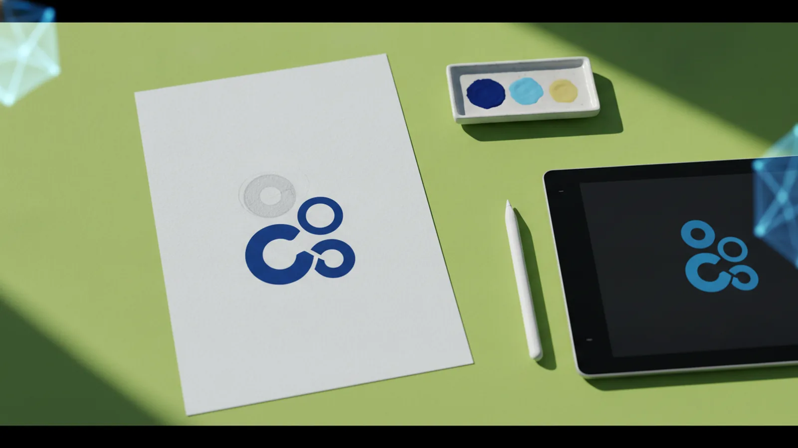
Understanding cute logo design
If you want to know how to make a cute logo, start with one goal. You want people to feel an instant spark of charm, not confusion. A cute logo should look playful, safe, and friendly at first glance. It also needs to work in real places, like a website header, a social profile, and a small badge.
This is part branding and part visual identity. Your visual design choices guide how people interpret your business personality. Cute logos do that by using approachable visuals, soft edges, and clear meaning. When the design is simple and consistent, it becomes easier to remember.
Think of cute as a design tone. It is not only about cartoon animals or pink colors. A craft brand can feel cute with warm tones and rounded type. A tech service can feel cute with minimal shapes and a friendly mascot.
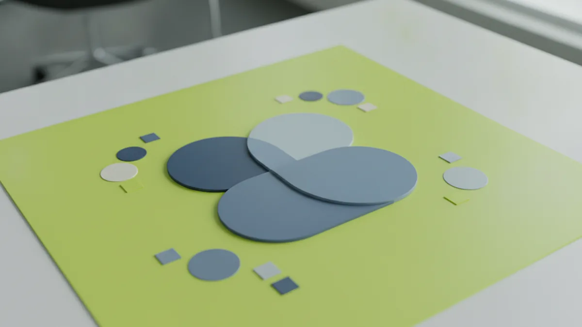
Key elements that make a logo feel cute
Most cute logo work comes down to a few repeatable building blocks. Color, typography, and imagery must work together, not fight each other. When those pieces agree on the mood, the logo reads as charming and cohesive.
Use these elements as your practical checklist for logo design. Keep the overall structure clean and avoid clutter. Simple shapes help the logo stay cute instead of busy. Minimal complexity also improves legibility when the logo shrinks.
- Color: Pick a small palette that matches the emotion you want.
- Typography: Choose type that feels warm and readable.
- Imagery: Use a mascot, icon, or symbol with clear form.
- Shape language: Prefer rounded corners and soft geometry.
- Balance: Give the design space to breathe.
For imagery, focus on recognizable silhouettes. A cute character shape can be built from a few circles and ovals. If you add too many details, the logo loses its charm at small sizes. This is especially important for business branding, where logos appear on cards, labels, and device screens.
Tools for creating cute logos
If you are learning how to create a cute logo, start with user-friendly tools. Online logo makers let you move faster, especially if you lack design software skills. Many also provide templates and icon libraries that you can customize.
Design software can give you deeper control. Vector tools let you refine shapes and keep the logo sharp at any size. That matters for a cute logo because it often relies on clean edges and simplified forms.
Here is how to choose your tool set based on your comfort level. Match the tool to your creative process, not the other way around.
- First draft: Use a DIY logo maker to test styles and layouts.
- Refine: Move to design software for better shape control.
- Export: Create web and print friendly files for branding.
- Test size: Check at 16px, 32px, and large hero sizes.
Even if you start online, plan to review the final output as a real brand asset. A cute logo design should survive small sizes, grayscale, and light backgrounds. If your logo needs luck to work, it is not ready.

Step-by-step logo design process
A clear creative process makes cute logo work easier. Use this step-by-step flow to understand how to make a cute logo design that stays memorable. The aim is to go from mood to concept to a clean final mark.
1) Define the charm in one sentence
Write a short “vibe” statement. For example, “gentle and playful for kids craft classes” or “warm and cozy for a home bakery.” This decision guides your shapes, colors, and typography choices. It also helps you compare ideas later.
2) List what your logo must communicate
Pick one core meaning. A logo for a pet sitter might center on a simple heart and paw symbol. A cute business logo for stationery could use a pencil tip or envelope icon. If you try to include everything, it will get complex and lose its charm.
3) Sketch simple shapes first
Before using a tool, sketch three rough concepts. Use circles, ovals, and rounded squares. Try one mascot idea, one abstract icon idea, and one letter-based idea. Cute often comes from strong silhouettes, not tiny details.
4) Build a first digital draft
In your DIY logo maker or vector tool, recreate your best sketch. Keep the structure simple. Use one main icon and one secondary element at most. Then align everything to a consistent grid.
5) Test readability and cuteness at small size
Zoom out and view your logo at small sizes. If the icon becomes a blob, reduce details. If the text turns into an unreadable line, adjust letter spacing and weight. This is a common failure point when people learn how to make cute logo for real branding use.
6) Iterate in small changes
Make one improvement at a time. Try a new color pair, then a new typeface, then a shape tweak. That approach helps you see what actually makes the logo cuter. It also saves time compared to random redesigns.
Color and font considerations for maximum charm
Color theory and typography are the fastest levers for how a cute logo feels. You do not need many colors. You need the right ones for the emotion you want.
Start with a color emotion map. For cute brands, soft colors often feel friendly. Bright accents can add excitement without looking harsh.
| Emotion cue | Color direction | Logo use |
|---|---|---|
| Calm and cozy | Warm beige, soft cream, light peach | Backgrounds, main shapes |
| Playful and upbeat | Sunny yellow, bright mint, coral accents | Highlights, secondary details |
| Trust and clarity | Deep navy or charcoal | Text, outlines, balance |
Next, limit your palette. Many cute logos work best with two main colors plus one accent. Too many colors usually make the design feel noisy. If you want a “cute” look that stays professional, pick restrained tones and add one bold pop.
Typography also matters a lot. Rounded typefaces, friendly letterforms, and consistent stroke weight help the logo feel approachable. Avoid extremely thin fonts for business use. They break at small sizes.
When you design your text, also manage spacing. Tight tracking can feel intense. Slightly open spacing usually feels more relaxed. For most DIY logo maker outputs, spacing is the first thing to correct.
Tips for finalizing your logo so it works everywhere
Once you have a cute concept, finalize like a brand designer. This is where how to make a cute business logo becomes real. You are not done when it looks good on your desk.
Check these details before you commit to a final version. Each one protects the “cute” effect at real sizes.
- Create a simple monochrome version: It should still read well in one color.
- Use a safe minimum: Ensure the icon works at 16px.
- Pick one primary layout: A horizontal and a stacked version is enough.
- Store clear files: Keep vector and high-quality exports for different uses.
- Confirm background contrast: Test on white, dark, and light tint backgrounds.
Also, align the logo with the rest of your visual identity. If your website uses harsh colors, the logo may feel disconnected. If your branding feels playful, then your logo should match that tone. This helps your audience trust what they see.
Finally, look for inspiration, but keep your own twist. Use design trends as a starting point. Then adjust the color palette, simplify the shapes, and customize the typography so it fits your brand.
Examples of cute logo styles to inspire your design
You can draw inspiration from existing cute logo designs without copying them. The goal is to study styles that already work and translate them into your own meaning. Here are a few cute logo styles that people often find effective for personal and business branding.
- Round mascot: A simple character face built from circles and a few curves.
- Friendly icon: A clean symbol like a heart, star, or leaf with soft edges.
- Playful monogram: A lettermark using rounded type and a simple underline or dot detail.
- Sticker-style badge: A badge outline with a limited palette and clear center icon.
When you explore inspiration, watch how the designer balances cuteness and clarity. Notice how many shapes they use and how thick the outlines are. Cute design often looks effortless because the underlying forms are controlled.
If you want a strong starting point, pick one style above and sketch three variations. Change one element per variation, like the mascot shape or the color accent. This method makes how to make cute logo work feel structured, not random.
As a next step, test your top pick in two real contexts. Use it on a small profile icon and as a header for your business. If it still feels charming in both, you are on the right track. Then export your final files and keep a consistent version for all branding uses.
Frequently asked questions
- What makes a logo look cute and charming?
- Cute logos use friendly shapes, a clear silhouette, and colors that feel warm. They also rely on readable typography and minimal clutter.
- How to make a cute logo if I’m a beginner?
- Start with a user-friendly DIY logo maker to test styles quickly. Then refine your best concept in a vector tool and check it at small sizes.
- How to create a cute logo for a business, not just a hobby?
- Choose one core meaning and keep the design simple. Test it on real brand uses like a website header and a small profile icon.
- What colors should I use for a cute logo design?
- Use two main colors plus one accent in most cases. Pick tones that match the emotion you want, like warm peach for cozy or bright mint for playful.
- How to make cute logo typography work?
- Pick rounded, readable type and avoid very thin strokes. Adjust spacing so letters stay clear when the logo shrinks.
- Where can I find inspiration for cute logo design?
- Look at existing cute logo styles and study how they balance shapes and readability. Then create your own versions by changing icon structure, colors, and typography.
Related reading
How to Make a Signature Logo That Fits Your Brand
Follow steps to create a signature logo, then polish it in Photoshop.
How to Add a Logo to Your Outlook Email Signature
Step-by-step: create an Outlook signature, insert a logo, resize it, and troubleshoot display issues.

How to Register a Logo as a Trademark (USA Steps)
Learn how to register a logo as a trademark in the USA—search, file, then maintain.