How to Make a Signature Logo (DIY + Photoshop Guide)
Learn how to make a signature logo with clear steps, signature-style design tips, and a Photoshop workflow. Avoid common mistakes.
Understanding Signature Logos
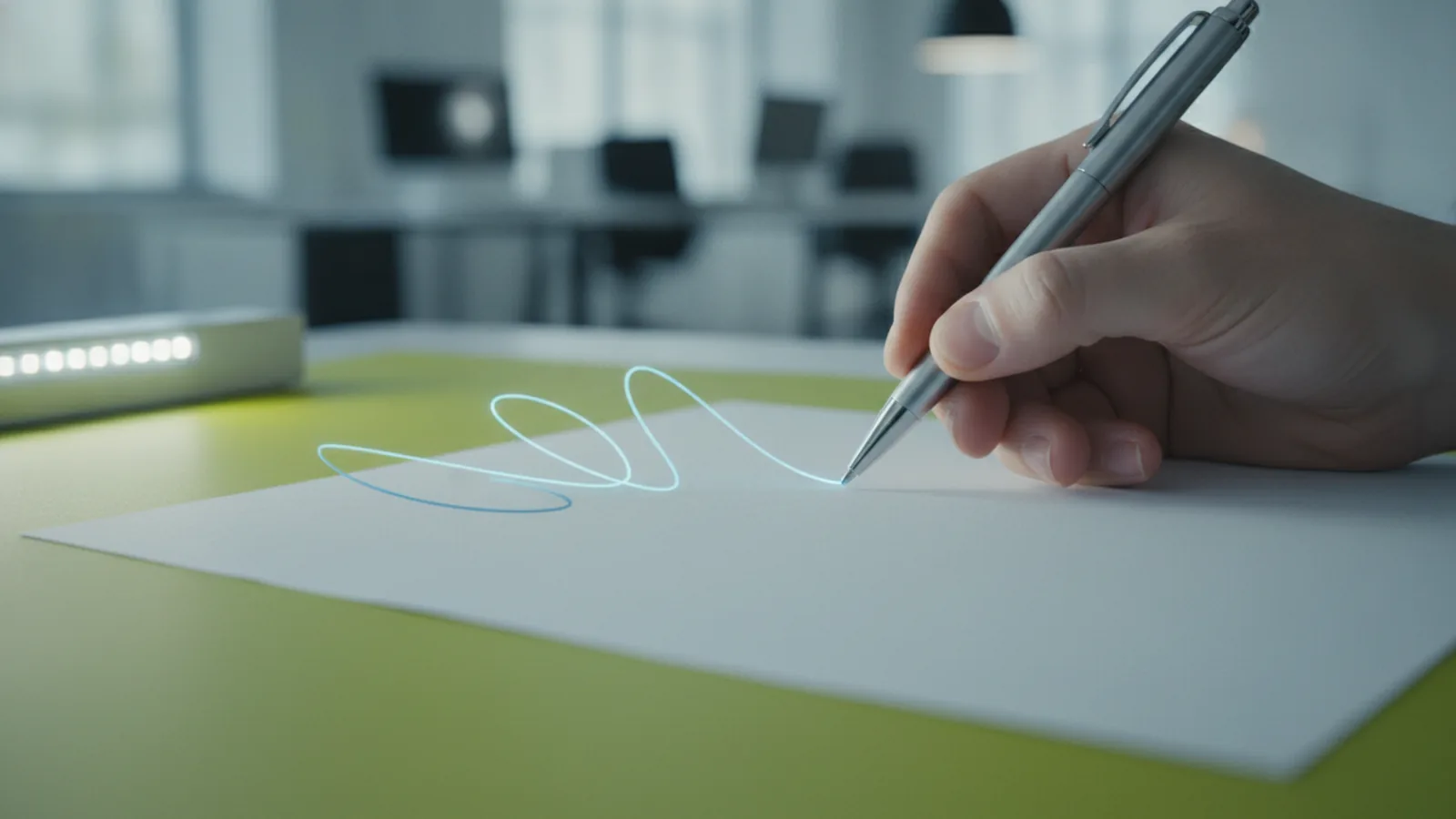
A signature logo looks like a personal mark. It uses a name, initials, or stylized text you can sign quickly. Many people search for how to make a signature logo because they want something that feels human, not corporate.
In practice, a signature logo is defined by flow and recognition. The letterforms connect or nearly connect. It should also stay readable when scaled down to a profile picture.
This type of logo can strengthen brand identity. It signals craft, trust, and continuity because it resembles how you naturally sign. For creators, founders, and small businesses, this can feel more personal than a standard wordmark.
Some brands also use signature logos for packaging and email footers. When your logo matches your writing style, customers often remember you faster. That is why how to create a signature logo is as much about taste as it is about tools.
Key Elements of a Signature Logo
Start with the signature content. Your goal is usually your name, initials, or a short brand phrase. Keep it short enough to look like a real signature, not like printed typography.
Next, focus on the structure. Many signature logos use three building blocks: baseline, x-height, and connecting strokes. Baseline is where letters sit. X-height is the height of lowercase forms. Connecting strokes control the “signature feel.”
Then define the style and intent. You can go classic with smooth curves. You can also go modern with sharp angles and controlled spacing. Pick one direction so the mark feels consistent.
Finally, plan for use cases. Your signature logo should work on a website header, invoices, and social icons. That means you need contrast and legibility across sizes. Color choice matters here, too.
- Legibility at small sizes and low resolution
- Signature flow through consistent stroke weight
- Typeface choice or custom lettering that matches your tone
- Color that holds up on light and dark backgrounds
Steps to Create a Signature Logo
If you want a reliable workflow, follow an idea-to-draft process. It is how to make your own signature logo without guessing from a blank canvas. Set aside 60 to 90 minutes for brainstorming and sketching.
Begin with brainstorming and constraints. Write your name or initials in three styles: fast, neat, and “overthink.” Then note what you like about each pass. Look for a curve, a loop, or a distinctive connection you can reuse.
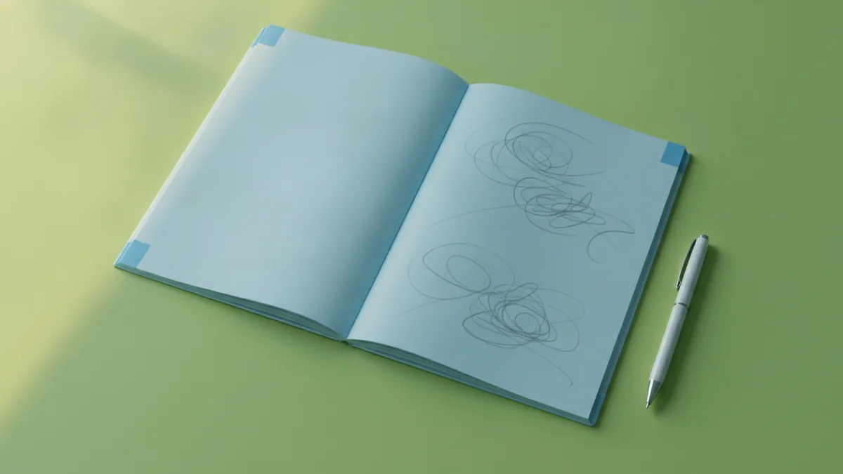
Now sketch ideas quickly. You are not making final art yet. Draw 10 to 20 small thumbnails on paper or in a digital sketch tool. Use light pressure so you can redraw fast.
After that, choose one concept to refine. Pick the sketch that is easiest to read at a small size. Then plan minor changes like stroke weight and spacing before you digitize.
- Pick your signature text (full name, initials, or short brand phrase)
- Collect 3 to 5 references for style, like vintage script or modern cursive
- Sketch 10 to 20 thumbnails and label what you like about each
- Select one draft based on flow and small-size readability
- Digitize and refine using vector or clean digital lettering
Feedback and iteration should be built into the plan. Show two drafts to a friend or coworker. Ask one question: “Can you read it quickly?” Then adjust based on what they say.
Designing a Signature Logo in Photoshop
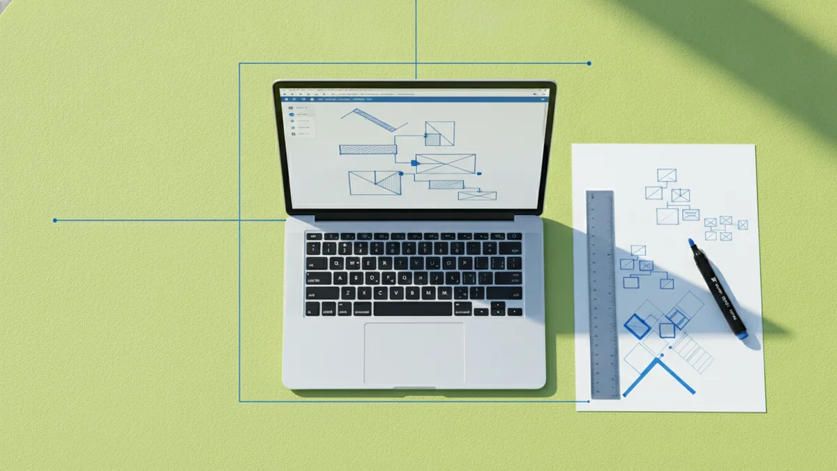
Learning how to create a signature logo in Photoshop is a practical path if you already know the basics. It is also a good way to start when you want a fast draft. The key is to treat your work as a digitizing step, then refine for clean output.
First, set up your file. Create a canvas around 2000 by 1000 pixels for a horizontal mark. Use a transparent background so you can test it on different colors later.
Next, choose your starting point. You can begin with a font and adjust it, or you can scan your signature. If you scan, take the photo with good lighting. Then increase contrast so the strokes are clear.
Then refine with selection and smoothing. Use pen tools or vector-like paths if you can. If you only have raster tools available, keep edits simple and avoid heavy blur. Your goal is clean edges, not an artistic smear.
Now tune the layout design. Place your signature so the heaviest stroke sits slightly below center. This creates a stable, signature-like balance. Then align the baseline so letters feel connected.
Finally, export in multiple formats. Use PNG for quick preview. If you can create vector output from your shapes later, do it. Vector graphics scale cleanly for print and future use.
For many people, how to design a signature logo in Photoshop comes down to careful tracing and spacing. Do not skip the spacing pass. In signature marks, spacing errors are more noticeable than in regular wordmarks.
- Test sizes by shrinking your logo to 64 pixels tall
- Check stroke consistency across loops and connectors
- Use layers for color, stroke, and text edits
- Plan transparency so you can place it anywhere
Tips for Customization
Customization is where your logo becomes yours. Start with typography in logo design. Even if you use a font, you should adjust it to match your signature rhythm. Change the letter spacing and tweak the curve where the signature “turns.”
Then use font selection strategically. If your signature is casual, pick a script font with natural loops. If your brand is modern, choose a script with clean terminals. Avoid fonts that look too decorative unless your brand tone supports it.
Color theory can guide your choices. Many signature logos work in one strong color with a second option for contrast. Use black or deep navy for reliability. If you want warmth, try dark brown. If you want energy, use a saturated accent.
Also refine layout design through alignment. Make sure the “signature peak” and “signature tail” feel intentional. The tail should not collide with the next line. If you plan a stacked version, create separate layouts.
For logo customization, consider three variants early. Create a horizontal version for headers. Create a compact version for icons. Create a dark-background version for social and ads.
- Adjust font spacing to mimic how you sign
- Match stroke weight across connected letters
- Choose two brand colors and test both backgrounds
- Create icon-ready crops for social profiles
Digital design tools can help too. Online logo makers are fine for early exploration, especially if you need a quick draft. Photoshop offers more control when you need refined curves and exact spacing. Pick the tool that matches your comfort level.
Common Mistakes to Avoid
Signature logos fail when they prioritize style over readability. The most common issue is too much detail in tiny sizes. If someone cannot read it on a phone screen, it will not work in real marketing.
Another problem is inconsistent stroke weight. If one loop is thick and another looks thin, the mark feels unstable. Signature logos need a steady visual “pressure,” even when curves vary.
Many people also make a mistake with color contrast. A beautiful color choice can become unreadable on light backgrounds. Always test on white, black, and a mid-tone gray.
Overcrowded composition is also common. If your name is long, you may try to cram everything into one line. Instead, consider initials or a shorter version. That is often how to make a signature logo that scales.
- Too many flourishes that break at small sizes
- Uneven spacing between letters and connectors
- Low contrast colors that fade on common backgrounds
- No iteration based on feedback and iteration in design
Finally, do not lock yourself to the first draft. Your first digitization is usually messy. That is normal. What matters is that you refine based on specific notes, not vague “it feels off” comments.
Finalizing and Downloading Your Logo
Finalizing means preparing files for real use, not just exporting one image. Start by confirming readability at multiple sizes. Check the logo in header scale, profile scale, and a small footer size.
Next, create clean background options. Export one version for light backgrounds and one for dark. Keep transparency enabled so you can place the mark on photos without a white box.
If you are using Photoshop, your final files may start as raster. Still, try to end with crisp edges. If you have used vector-like shape layers, you may be able to export smoother results. When possible, aim for vector graphics for print and long-term scaling.
Then package your deliverables. Save working files with layers intact. Export PNG and a transparent version for fast use. If you can also export an SVG or similar file, do it for future editing.
Before you ship, get final feedback on the two most important variants. Ask one person to judge readability and one person to judge style match. This is where brand identity becomes real. When both checks pass, you are ready.
When you know your “signature feel,” you can design faster. Use your own writing as the reference point.
FAQ: Signature logo creation
How do I make a signature logo that looks like me?
Use your own written signature as the baseline. Digitize it, then refine only the parts that confuse readability. Keep the unique loop or connection you use every time.
What is the best way to create a signature logo for a brand?
Pick one style direction and test it across sizes early. Make a horizontal version for headers and a compact version for icons. Keep spacing and stroke weight consistent.
Can I create a signature logo in Photoshop?
Yes. Start from a scanned signature or a script font. Then refine curves, spacing, and contrast using clean layers.
Do I need expensive tools to design a signature logo?
No. You can start with simple digital design tools and later upgrade. If you need precision, Photoshop is a strong choice for refinement.
How do I get feedback while designing?
Show two drafts and ask a single task question. For example, “Can you read this in two seconds?” Then update based on what they struggle with.
Frequently asked questions
- How do I make a signature logo that looks like me?
- Start from your own handwriting or a signature sample. Digitize it, then adjust spacing and stroke weight for clarity. Keep the distinctive loops you already use.
- How to create a signature logo for my brand identity?
- Use one consistent style direction and test it on multiple backgrounds. Create horizontal and compact variants for real-world use. Keep readability first.
- What tools can I use to make a signature logo?
- You can use Photoshop for careful digitizing and refinement. Online logo makers work for quick drafts, especially at the start.
- What is the step-by-step process to design a signature logo?
- Brainstorm your initials or name style, sketch 10 to 20 thumbnails, and pick one draft. Digitize, refine connectors and spacing, then export final variants. Use feedback to guide iterations.
- What are common mistakes when making a signature logo?
- Avoid tiny unreadable details and inconsistent stroke weight. Also test contrast on light and dark backgrounds before you finalize.
- How do I create a signature logo in Photoshop?
- Start with a scanned signature or a script font, then refine curves and spacing. Keep layers organized, test at small sizes, and export transparent PNG versions.
Related reading
How to Add a Logo to Your Outlook Email Signature
Step-by-step: create an Outlook signature, insert a logo, resize it, and troubleshoot display issues.

How to Register a Logo as a Trademark (USA Steps)
Learn how to register a logo as a trademark in the USA—search, file, then maintain.

How to Make an Image Transparent in Canva for Logo Design
Learn how to make image transparency in Canva and use it for logo design.