How to Create a Clothing Brand Logo (Steps + Tips)
Learn how to create a clothing brand logo with clear steps: brand identity, competitor research, mood boards, typography, colors, tools, and testing.
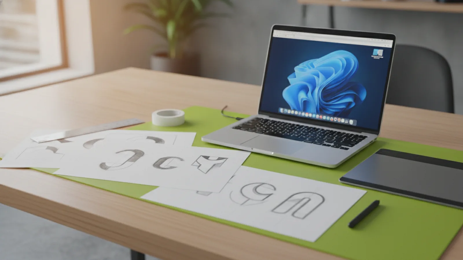
Start with your brand identity, not a logo idea
If you want to know how to create a clothing brand logo, the first step is clear brand thinking. Define what your brand is, who it serves, and what it stands for before you open any design tool. A logo is a shortcut for customer trust, so it should match your product reality.
Write a short brand statement and expand it into values you can actually explain. For example, “street-ready basics” is a vibe. “Built for everyday wear, priced fairly, and made to last” is a value set. Then turn those values into traits you can design with, like bold, calm, playful, or technical.
Use this quick work pad to guide the logo design process. It keeps your choices consistent when you pick typefaces, colors, and icon styles later.
- Audience: age range, lifestyle, and where they shop.
- Brand traits: 3 adjectives that you can defend.
- Proof: fabrics, fit, materials, or service that backs the claims.
- Price level: budget, mid, or premium, and why.
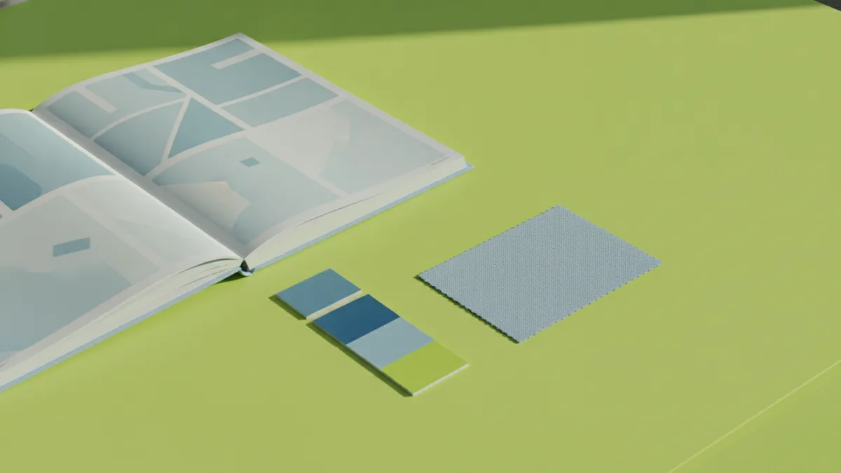
Research competitors to spot patterns and gaps
Market research is part of learning how to create your own clothing logo. You are not trying to copy. You are learning the “visual language” customers already expect in your category.
Collect 20 to 30 competitor logos across your direct lane. Include brands with similar price points, not just similar styles. Look at how they handle name treatment, iconography, and layout.
As you review logos, log what repeats. The goal is to find trends you should respect and details you should avoid so your logo stays distinct.
- Style: monogram, wordmark, emblem, or symbol-first.
- Typography: serif, sans-serif, slab, or hand-drawn.
- Color psychology: what hues signal luxury, youth, or sport.
- Spacing: tight kerning for modern feels, looser spacing for calm.
- Complexity: fine lines that may break at small sizes.
After your review, write a “differentiation note.” For example, “We will use a clean sans-serif wordmark, but with a custom cut on one letter.” That single sentence keeps your logo design focused.
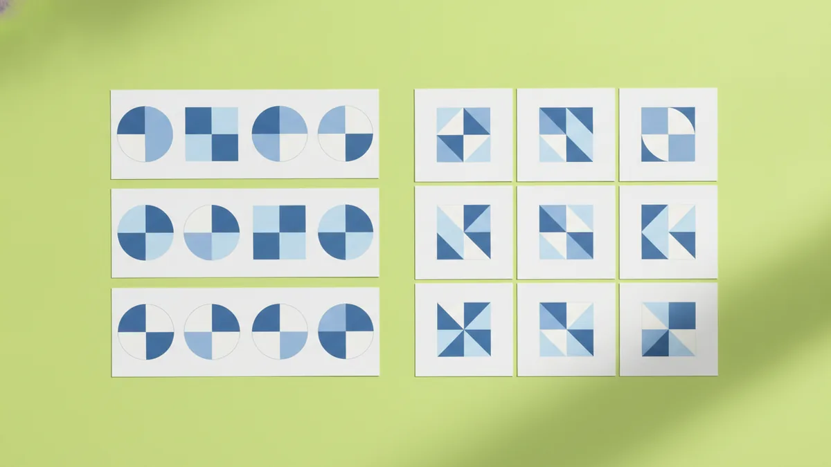
Sketch multiple directions, then build a mood board
Before you design, brainstorm sketch ideas. Many clothing logos start as simple forms: initials, a small icon, or custom lettering that turns your name into a mark. Plan for 10 to 30 thumbnail sketches so you have options when you narrow down.
Use a mix of approaches so you cover different brand outcomes. Try an icon that connects to your story, and also try a typographic path where the name is the logo. In clothing, a strong wordmark often works for tags, hangers, and ecommerce headers.
To make your first drafts feel on-brand, create a mood board. Include logos, color swatches, fabric textures, and packaging references. If your brand uses denim, knit, or leather, collect close-up texture images so you can translate texture into line weight and shapes.
- Pick 6 to 10 references that match your desired vibe.
- Extract 2 to 4 traits from each reference, like “rugged” or “sleek.”
- Save texture cues like stitching patterns, weave, or brushed finishes.
- Decide your direction for a symbol, a wordmark, or an emblem.
When you sketch, include at least three variations of each idea. Try a condensed version, a version with more breathing room, and one that works in a circle or rectangle.
Choose typography and colors that match the vibe
Typography choice is central to how to create a clothing logo that feels intentional. Different fonts signal different brand types. A serif often reads as classic or luxury. A sans-serif tends to feel modern and clean. A slab-serif can lean bold and heritage.
You do not need a complicated font system. Pick one primary typeface family and one supporting role, like a tagline or secondary line. If you plan a simple logo, you can skip the second font and rely on weights instead.
Next, choose a color palette that conveys your brand message. For clothing logos, simplicity wins most of the time. Aim for 1 to 3 core colors so your mark works on fabric, embroidery, and print.
| Brand goal | Common color cues | Design tip |
|---|---|---|
| Premium and calm | Black, deep navy, muted neutrals | Use high contrast or soft gray accents. |
| Sport and energy | Bold greens, reds, bright blues | Keep shapes simple for quick readability. |
| Street and playful | Warm tones, strong contrast pairs | Use a clean wordmark with a small icon. |
Color psychology is useful, but it should support your actual product. A “luxury” palette must still look premium on small labels and in one-color printing.
Use design tools to create clean, professional logo files
When people search how to create clothing brand logo files, they often miss the difference between drafting and building. Start with a tool you can export from, then refine the vector shapes so the logo stays sharp. If your output is only a raster image, you will hit problems during embroidery or signage.
Design tools match different skill levels. Canva can help beginners build a basic wordmark quickly, especially for early mockups. Adobe Illustrator is the common choice for professionals because it supports precision vector work. If you use another vector app, the key is export quality and control over spacing.
Use this practical rule while building your logo in any tool. Keep your iconography bold and avoid ultra-thin strokes that vanish when printed small.
- Wordmark: refine letter spacing and alignment.
- Icon: test it at small sizes early.
- Composition: keep margins consistent across variations.
- Variants: prepare horizontal and stacked layouts.
If you plan custom lettering, build it as a vector. That way, you can adjust curves later without losing quality.
Test your logo for scalability across real platforms and media
Scalability is the last and most important stage of how to create a clothing brand logo. Your logo must look good on a website header, a product tag, a social profile, and a woven label. A design that looks great at 3000px can fail at 24px.
Run tests before you declare the logo “done.” Export one-color versions, reverse versions, and simplified versions. If your logo relies on gradients or tiny details, use a simplified style for small placements.
Test these common surfaces with realistic sizes:
- Favicon or app icon size: looks at 16px to 32px.
- Woven label: check at small embroidery-like thickness.
- Sticker or hang tag: confirm readable edges and contrast.
- Social header: confirm layout doesn’t crop awkwardly.
- One-color printing: confirm the mark still reads clearly.
If a detail disappears at small size, fix it now. Make strokes thicker, increase spacing, or reduce the number of elements. It is faster to simplify early than to redesign after you order labels.
Finally, store your logo assets in a simple folder. Include vector originals, transparent PNGs, and one-color exports. That makes future updates and scaling much easier.
Frequently asked questions
- What is the first step in how to create a clothing brand logo?
- Start by defining your brand identity, values, and audience. Then translate those traits into design directions like style, tone, and visual proof.
- How do I research competitors for logo design?
- Collect 20 to 30 similar brands and review their layout, typography, colors, and complexity. Note what repeats and what you can do differently to stand out.
- Do I need a mood board for a clothing logo?
- Yes, a mood board helps you connect logos, colors, and texture into one visual direction. It also speeds up your sketching by making your choices less random.
- What typography should I use for a clothing brand logo?
- Match type style to brand type. Serif fonts often feel luxury, sans-serif feels modern, and slab styles can feel bold and heritage.
- What color palette is best for a clothing logo?
- Keep it simple with one to three core colors. Make sure your logo still reads well in one-color and reversed versions.
- How can I tell if my logo is scalable?
- Test it at small sizes like 16px to 32px and on real placements like labels and social icons. Simplify strokes and shapes if details disappear.
Related reading
How to Make a Clothing Brand Logo That Fits Your Brand
Learn how to make a clothing brand logo that looks sharp, fits your style, and tests well.
How to Create and Place a Logo on Letterhead
Get logo sizing and placement tips for a professional letterhead.
How to Come Up With a Good Logo Design
A step-by-step logo process: identity, inspiration, competitors, style, color, and testing.