How to Create a Face Logo That Fits Your Brand
Learn how to create a face logo with clear steps for concept, colors, typography, symbols, and logo formats for real-world use.

Understanding face logos
A face logo is a brand mark that uses a human face - realistic, illustrated, or abstract - to express identity. It can be a full face, a partial profile, or even stylized facial shapes that imply expression. People connect to faces fast. That makes a face logo a strong choice for brand identity when you want trust, warmth, or personality.
However, a face logo also carries risk. Faces are easy to recognize, so unclear design can look generic. It can also feel unsettling if proportions or expression feel off. Good design principles keep it memorable and professional. The goal is a symbol people can recall in one glance.
In branding, a face logo works best when it matches your business branding goals. A friendly face can support customer-facing services. A sharp, geometric face can support tech or finance vibes. Your design should stay consistent across color, typography, and icon design choices.
- Memorable: the silhouette should be recognizable at small sizes.
- Flexible: it should work in one color and two-color versions.
- On-brand: expression and style should fit your business branding.

Steps to create a face logo (from concept to final)
If you want to know how to create face logo concepts that actually ship, start with a short brief. Write what your brand stands for in one sentence. Then list three traits you want people to feel, like confident, calm, or playful. Those traits should guide your expression, line weight, and shape language.
Next, sketch several variations. Aim for 8 to 12 thumbnails in 30 to 45 minutes. You are searching for a silhouette first, not perfect detail. Choose 2 concepts to refine. If both look too similar, go back and change the face angle or style.
Once you pick a direction, build a vector graphic. Use vector graphics so you can scale without losing edges. Then create a simple lockup: face mark alone, plus face mark with the brand name if you need it. Plan logo customization early so you can test versions for light and dark backgrounds.
- Write your brand traits and pick an emotion for the face.
- Sketch thumbnails to explore angles and silhouettes.
- Select one direction and refine facial proportions.
- Convert to vector graphics and clean up shapes.
- Test on real surfaces like icons, headers, and favicons.
- Export logo formats for every use case.
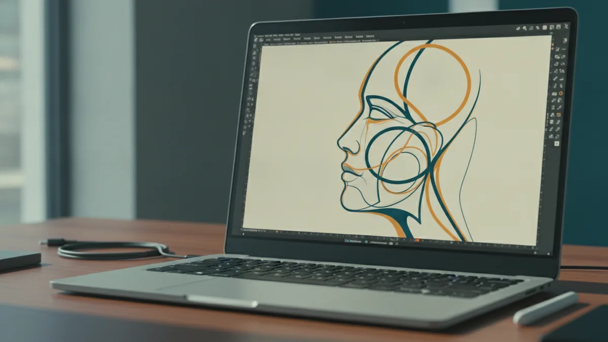
Choosing the right colors and using color psychology
Color choice can make or break a face logo. Even a strong design can look weak if colors fight with the expression style. Start with two jobs: readability and emotion. Your face mark should stay clear on light and dark backgrounds.
Color psychology gives you a starting point for emotion. For example, blue often signals trust and calm. Red can feel bold or energetic. Green is commonly linked to growth and steadiness. But the same color can feel different depending on saturation and contrast.
A practical approach is to pick a primary color and a support color. Then decide whether you want a flat look or subtle shading. For face logos, flat fills often scale better. If you use gradients, keep them simple so they do not break in one-color versions.
| Color family | Common brand feel | Design tip for face logos |
|---|---|---|
| Blue | Trust, calm | Use clean lines and mid contrast fills. |
| Red | Energy, urgency | Keep features bold to avoid muddy shapes. |
| Green | Growth, balance | Pair with neutral grays for stability. |
| Black/white | Premium, minimal | Design for strong silhouette first. |
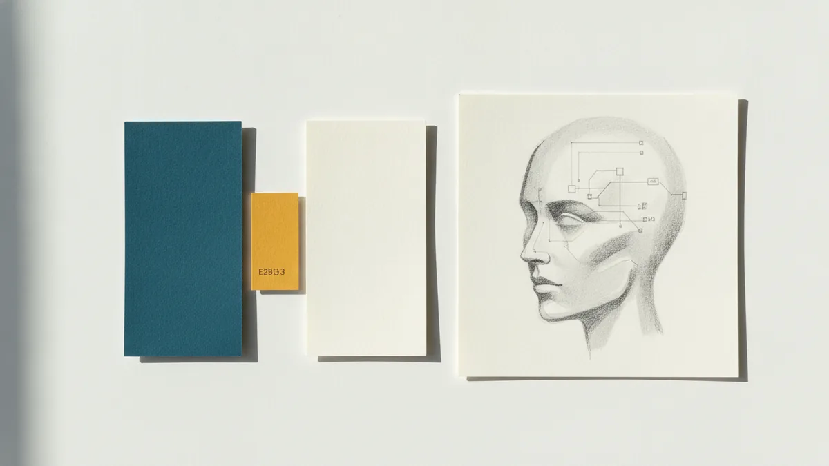
Selecting fonts for your logo lockup
Typography controls how the face logo “speaks” alongside your brand name. Even if the face is the hero, the text needs to match the visual tone. Choose a font style that fits the expression you built into the face. A friendly face pairs well with rounded letterforms. A sharp, geometric face pairs well with clean sans typography.
Legibility is the biggest constraint. Test your wordmark at 16px and at small thumbnail sizes. If letters merge or counters fill in, pick a different font or adjust spacing. Good typography supports business branding by making the logo easy to read across devices.
Also plan for consistency. If you customize letter spacing, do it once and keep it stable. If the brand needs multiple weights, pick regular and bold at minimum. Then build a single system for logo customization so you do not end up with mismatched versions later.
- Match mood: rounded fonts for warm tones, angular fonts for sharp tones.
- Keep it readable: verify at small sizes.
- Use consistent spacing: avoid one-off tweaks.
- Limit font count: one family with two weights is often enough.
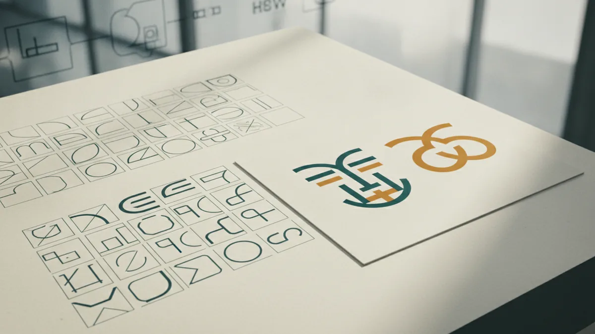
Iconography and symbols in face logo design
Icons and symbols can add meaning beyond the face itself. Think of them as supporting details, not clutter. A small star, leaf, or wave can connect the face to your category. But keep the symbolism aligned with your design principles and your brand identity.
Facial features can act as icon design elements. For example, eyebrows can form a recognizable shape. Eye highlights can become dots that echo your brand’s pattern language. Even hair shapes can turn into a repeatable motif. This is a clean way to make the face logo feel unique.
When you add symbols, watch for clarity at small sizes. If the symbol disappears at 24px, simplify it or move it into a second mark version. You can also create a badge style where the symbol sits behind or beside the face, then keep the main face version minimal.
Your best goal is one signature shape, plus optional details for stronger storytelling.
That balance keeps the logo memorable without becoming hard to reproduce. It also helps you create a cohesive icon set later, if your brand needs more marks.
Tips for effective, memorable, unique face logos
To make your face logo stand out, avoid copying common face stereotypes. Many logos look like generic avatars because the proportions match “default” clipart. Instead, pick one design constraint and commit to it. For example, use a limited palette, a strict geometry grid, or a single line style.
Test the face mark in grayscale early. If it reads well in black and white, color will usually be easier to fix. Then check contrast around key features like eyes and mouth. Those details carry expression. If the contrast is too low, your face can look flat.
Also plan for uniqueness through composition. Try different angles like 3/4 view or a clean profile silhouette. Use negative space thoughtfully around cheeks or hairline. This creates an ownable shape people remember without needing extra complexity.
- Design a strong silhouette before adding detail.
- Use limited shapes for faster recognition.
- Keep feature contrast high for eyes and mouth.
- Create one-color versions for real-world printing.
Finalizing and downloading your logo formats
Finalizing means you have the right files for every place your face logo will appear. Different use cases need different formats. A good set reduces future rebuilds and keeps your logo sharp for business branding.
Here is a practical export plan for design face logo workflows. Always keep the master file in your vector editor. Then export branded versions you can hand to printers, web teams, and developers.
| Format | Best for | Notes |
|---|---|---|
| SVG | Web and icons | Scales cleanly and supports crisp edges. |
| PNG | Fast previews and UI | Use transparent background for flexibility. |
| JPG | Photos and simple sharing | Not ideal for sharp logos, since it has no transparency. |
| Print handoff | Often accepted by printers for vector marks. | |
| EPS | Older print pipelines | Useful if a vendor requests it. |
For file sizing, export at a few key sizes. For example, create 512px and 1024px PNG previews. Keep vector exports as your source of truth. When you make your face logo for social, check how it looks inside circular crops. Faces can shift in crops, so verify the eye line stays centered.
When you have all this ready, you can confidently make your own face logo system. You will know which version to use, how it scales, and how it stays readable. That is what turns a concept into a real brand asset.
Frequently asked questions
What is a face logo in branding?
A face logo is a brand mark that uses a human face as the main symbol. It helps communicate personality and identity quickly.
How do I create a face logo from scratch?
Start with a short brand-trait brief, then sketch multiple face silhouettes. Refine one direction in a vector tool, and test one-color versions early.
How do I choose colors for a face logo?
Pick colors for both emotion and readability. Test the face mark on light and dark backgrounds and in grayscale.
What font works best with a face logo?
Choose a font that matches your face style and stays readable at small sizes. Usually one font family with two weights is enough.
Can I include symbols or icons with a face logo?
Yes, but keep them supportive and simple. Make sure details still read at small sizes and do not clutter the silhouette.
What logo formats should I download for my face logo?
Export SVG for web, PNG with transparency for UI and previews, and PDF for print handoff. Keep your master vector file for future logo customization.
Share this article
Related articles



Building something similar?
Tell us about your product — we respond within one business day with a concrete next step.