What Is a Logo? A Clear Guide to Marks, Types, and Design
Editorial Team · August 05, 2026 · 6 min read · Guide
Learn how digital marketing agencies find clients through referrals, LinkedIn, cold email, Google PPC, lead tools, ICPs, and clear sales metrics.

What Is a Logo?
What is a logo? It is a visual sign for a brand, company, product, or group. It may use a name, initials, symbol, shape, or mix of parts.
A simple answer to “what is a logo definition?” is this: a logo is a graphic mark made for recognition. It gives people a quick visual cue. It does not explain every part of a business.
People also ask what is logo in English. The English word “logo” refers to a brand mark. What is logo short for? It comes from “logotype,” a term once linked to a name set in a special type style.
Today, logo has a wider meaning. It can describe a symbol, wordmark, or full mark system. The mark supports brand identity, but it is not the whole brand.
What the logo means depends on its use and the brand behind it. A mark gains meaning through repeated contact. Its shape alone cannot build trust.
Types of Logos and Logo Marks
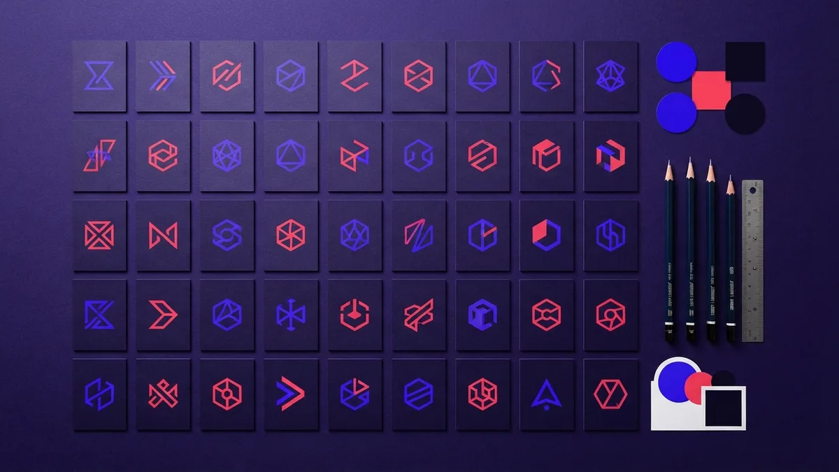
What is a logo mark? It is the symbol part of a brand identity. It may sit beside a name. It may also work alone after the audience learns it.
What logo is best depends on the brand name, audience, and use. A short name may suit a wordmark. A complex name may need a symbol or lettermark.
- Wordmark: This uses the full name in a distinct type style.
- Lettermark: This uses initials or a shortened name.
- Pictorial mark: This uses a clear image or object.
- Abstract mark: This uses a nonliteral shape with open meaning.
- Mascot mark: This uses a character with a warm, active tone.
- Combination mark: This joins a name and symbol.
What is a logo lockup? It is a set layout for two or more logo parts. It fixes their order, size, and spacing.
What is a logo suite? It is a group of related marks for different needs. A suite may include a main mark, submark, icon, and one-color version.
What is a logo tagline? It is a short phrase placed with a mark. A tagline can add context, but the logo should still work without it.
Why Logos Matter in Branding
A logo serves as a visual representation of a brand or company. People often notice shape and color before they read a name. A steady mark helps a brand stand out during fast choices.
Brand recognition grows through repeated use. The same core mark should appear across key brand touchpoints. These may include sites, packages, signs, apps, and social profiles.
Logos can support consumer trust. A clear mark can make a business feel stable and ready. Trust still rests on the full customer experience.
What is a logo used for? It helps identify the source of a product or service. It also helps a brand stay distinct in busy markets.
- Use one core mark across major brand channels
- Keep colors and type styles steady
- Prepare light, dark, and one-color versions
- Match the mark’s tone to the target audience
A logo can also carry symbolism. A sharp form may suggest speed or strength. A soft form may suggest care or calm.
What Is Logo Design? Key Elements That Matter
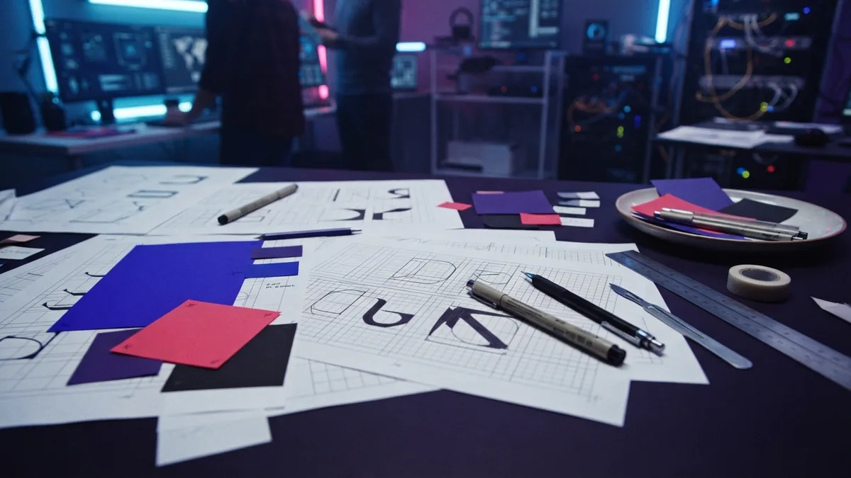
What is logo design? It is the process of shaping a mark for clear brand use. It can include research, sketches, type, color, form, and testing.
A logo concept is the main idea behind a mark. It guides the shape, type, and visual tone. Strong concepts link a brand truth with a simple visual cue.
What is a logo in art? It is applied visual art made for recognition and use. It must work as a sign, not just as a pleasing drawing.
| Element | What it should do |
|---|---|
| Simplicity | Keep the mark clear and easy to recall. |
| Memorability | Give people one strong feature to remember. |
| Versatility | Work across print, screens, signs, and goods. |
| Relevance | Fit the brand, market, and audience. |
| Scalability | Stay clear at tiny and large sizes. |
Typography needs close testing. Thin strokes may vanish at small sizes. Tight gaps may blur on a screen.
Color theory can guide choices, but color has no fixed meaning. Test the mark in black and white first. Then check it on real backgrounds.
What should a logo have? It needs a clear idea, useful shape, and fitting type style. It does not need many details or effects.
How to make logo art starts with a rough idea. Sketch many options, remove weak parts, and test the best form. Then build clean files in vector form.
Logo animation adds motion to a finished mark. It can suit videos, apps, and digital ads. Animation should support recall, not hide a weak design.
How to Identify an Unknown Logo
If you ask, “what is this logo,” start with the image itself. Note its shapes, colors, initials, and unusual details.
If you ask “what logo is this?” note where you found it. The setting may be a product, sign, site, app, or sports item.
Visual search tools can match an image with known marks. Crop away busy areas before you search. A sharp, centered crop gives better results.
Try more than one crop when the mark has small details. Search the brand name with the item or place where you saw it. Check the result against the brand’s own site.
What is a logo URL? It is the web address for a logo file or brand page. To get a logo URL, open the file, copy its full address, and test it in a new browser tab.
A logo URL should point to a stable file. Use a trusted source when sharing it. The USPTO trademark basics page explains how marks help identify goods and services.
Common Logo Design Mistakes
Overcrowding is one of the most common errors. Too many shapes, colors, and effects make a mark hard to recall.
Poor color choices can weaken contrast. A mark may look fine on a bright screen but fail on dark stock or print. Check contrast in several real settings.
Lack of scalability creates another problem. A detailed mark may work on a poster but fail as a small icon. Build versions for small, medium, and large use.
- Do not copy a rival mark or follow every short trend
- Do not rely on color to carry the full meaning
- Do not use type that becomes hard to read
- Do not approve a mark before testing real sizes
The registered mark symbol, ®, shows a registered trademark in some regions. What is the R next to a logo? It warns that the mark has legal registration.
What is the R on a logo? It is not a design feature. Use it only when registration rules allow it.
What was the first logo? There is no single agreed answer. Ancient makers used marks on goods, while modern brand logos grew with mass trade.
Practical Questions About Logo Work
What do logo designers do? They study a brand, plan concepts, draw marks, test files, and prepare use rules. They also refine type, color, spacing, and file formats.
How much do logo designers make? Pay varies by skill, place, work setting, and client type. Freelancers may charge by project, while staff designers often earn a salary.
Where should a logo go on a shirt? The left chest is a common choice for a small front mark. The right side can work when the design or garment layout calls for it.
What side should a logo go on a shirt? There is no fixed rule. Pick the side that gives the best balance, comfort, and brand view.
A good logo stays clear, useful, and tied to the brand. It should work in art, print, motion, and daily use. Most of all, it should help people know who made the thing.
- design tokens naming conventions
- component states responsive behaviour
- design-to-code documentation
- acceptance criteria for UI components
- visual regression testing
Frequently asked questions
What is a design-to-code handoff?
It is the process of moving component specifications, tokens, and states from a design system into production code with matching behaviour and accessibility.
Who owns a component after launch?
A single named owner — usually a design-system engineer or the pod that shipped it — is responsible for triaging changes, deprecations, and upgrades.
How detailed should design tokens be?
Detailed enough that no colour, radius, spacing or motion value is redefined in application code. Semantic tokens should reference primitive tokens.
When is visual regression testing worth the cost?
As soon as a component appears on more than one page — screenshot diffs catch unintended visual shifts that unit tests never see.
Share this article
Building something similar?
Tell us about your product — we respond within one business day with a concrete next step.