How to Design a Logo That People Remember
Design a clear logo from first sketch to final brand files.
Understanding Logo Design Basics
A logo is a quick sign for a brand. It helps people spot a business in many places.
A strong logo builds fast recognition. It also sets a business apart from close rivals.
So, how do you design a logo? Start with the brand, not effects or tools.
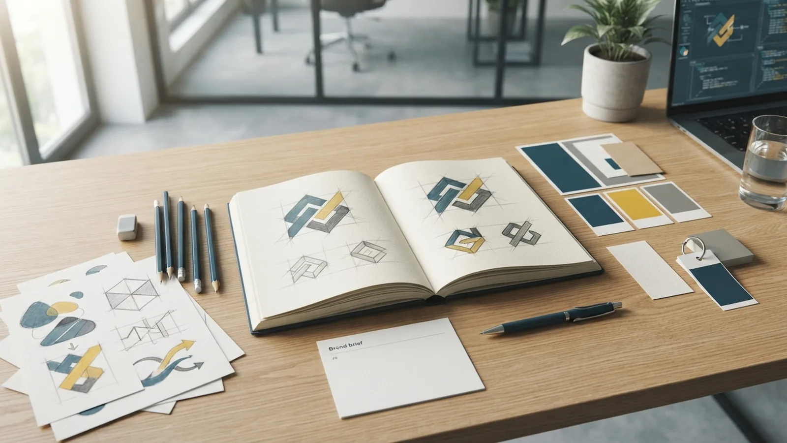
The logo design process begins with a short design brief. Record the name, audience, offer, tone, and main uses.
- Define the brand promise in one clear sentence
- List three traits the mark should show
- Note where the mark will appear most often
- Study rival marks for gaps and shared patterns
Choose the right mark type early. A wordmark uses the name as its main form.
A symbol works well at small sizes. A combined mark uses both parts.
If you ask how to design your logo, begin with clear goals and simple tests.
The same method answers how can I design a logo. Link each choice to a real business need.
Identify Brand Values Before You Draw
Ask what the brand should make people feel. Trust, speed, care, craft, and boldness need different cues.
Ask for proof behind each value. A firm that claims simple should offer a clear service.
Write one design goal before you sketch. For example, aim for a calm mark for safe data tools.
Keep the goal short. It gives you a clear test for every idea.
- Trust may use stable shapes and open space
- Energy may use active angles and strong contrast
- Care may use soft forms and warm tones
- Craft may use refined type and useful detail
Build a small mood board with shapes, colors, type styles, and image themes.
Use five strong references. Do not mix fifty unrelated ones.
Do not copy a rival’s shape or color set. Find a visual gap instead.
That gap helps people tell brands apart. It also gives the mark a clear place in the market.
Sketch Ideas and Build Rough Prototypes
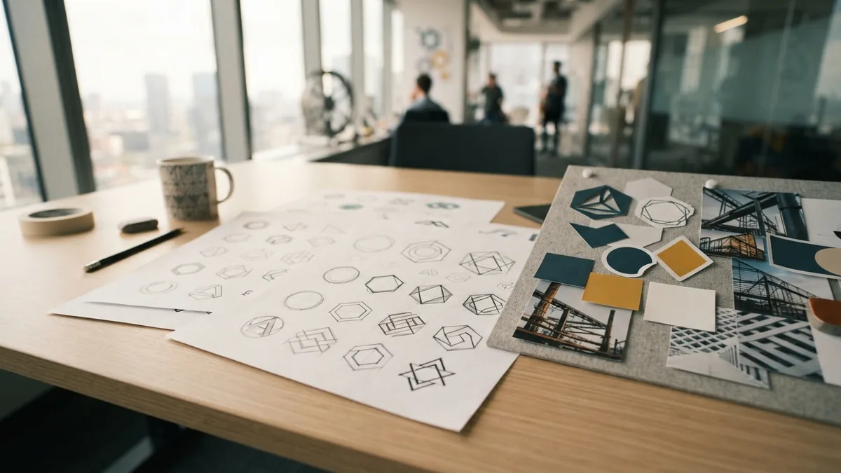
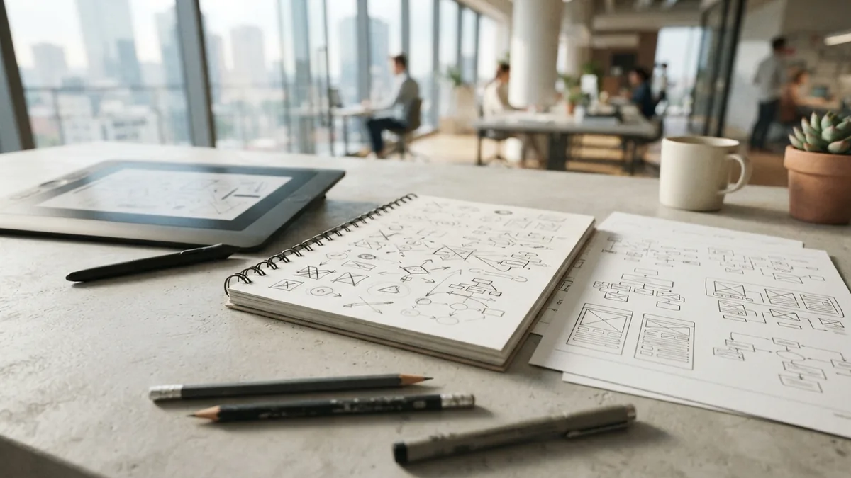
Sketching frees your mind from tool limits. Use paper, a pencil, or a basic tablet.
Set a timer for 20 minutes. Make at least 20 rough ideas.
Try symbols, name shapes, and open space. Speed matters more than polish now.
A weak sketch can still spark a strong idea. Keep moving until one concept feels fresh.
Start in black and white. Color can hide a weak shape or lift an average one.
If you ask how can I design my own logo, start small. Test many ideas before refining three.
You can design a logo for free with paper and free design tools.
Paid tools are not needed for the first round. The idea matters most.
Choose three sketches for a first digital draft. Rebuild them with vector paths.
Vector art stays sharp at any size. It also makes later changes much easier.
- Make one idea from the brand name
- Make one idea from the brand promise
- Make one idea from an abstract shape
- Remove detail that does not aid meaning
To learn how to design a logotype, start with the name. Check its width, rhythm, and key letter forms.
Adjust unusual forms with care. A custom name mark should still read at a glance.
Choose Color and Typography With Care
Once the shape works in black and white, add color. Color theory can guide mood.
It cannot fix a weak idea. The form must work before the palette is set.
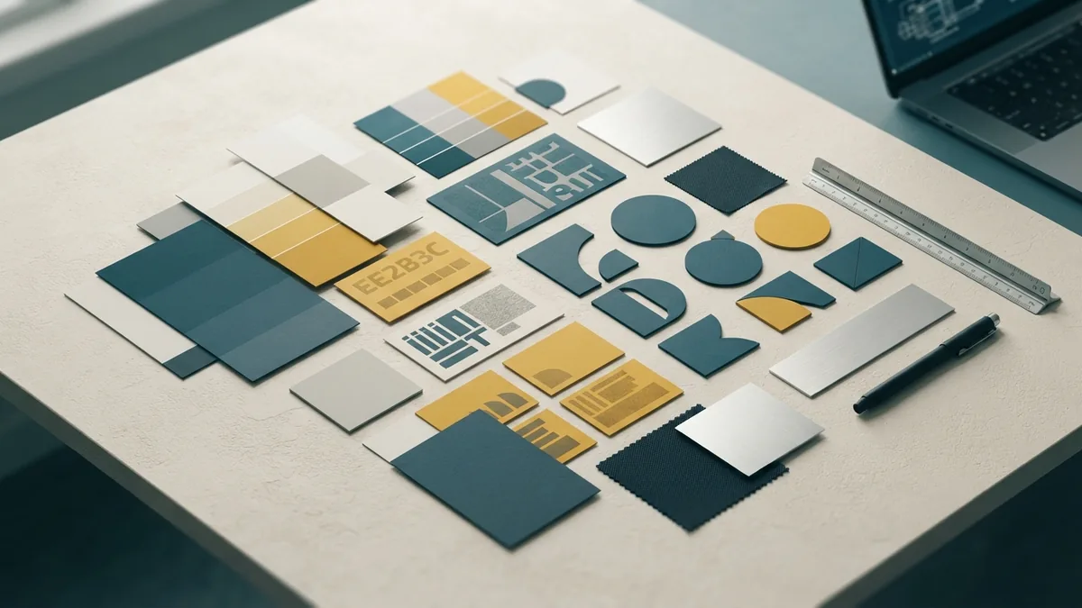
Start with one main color and one support color. Add a third only when it has a clear job.
Choose colors for the audience, not for personal taste. A youth brand may need more energy.
A legal firm may need a calmer tone. A fashion brand may need a refined palette.
Check contrast in every key use. The mark must work on light, dark, and plain backgrounds.
| Brand cue | Useful starting point |
|---|---|
| Trust and calm | Deep blue or muted green |
| Energy and action | Warm red or bright orange |
| Nature and care | Green, clay, or warm neutrals |
| Luxury and craft | Dark tones with one calm accent |
Typography sets the voice of a wordmark. Rounded type can feel warm.
A clean sans serif can feel direct. A serif can suggest craft or history.
Check the name at small sizes before choosing a type style.
Look for tight gaps and weak forms. People should read the name in one quick glance.
Free tools such as Canva help beginners test simple layouts. Illustrator suits precise vector work.
Photoshop can help with mockups. It should not be your main vector tool.
For a free online path, begin with a template, then change its type and shapes.
That approach can answer how to design a logo in Canva without copying the first result.
Keep enough contrast for key uses. The W3C accessibility guidelines give a trusted base for contrast checks.
Keep the Mark Simple and Easy to Recall
Simple marks are easier to remember. They also scale well across signs, tabs, packages, and phones.
Remove lines, shadows, and tiny gaps that add no meaning. Small details often vanish first.
Test the mark at three sizes. Use a large artboard, a social icon, and a tiny browser tab.
Ask what people notice in two seconds. Their first answer shows the mark’s strongest cue.
- Use one clear focal shape
- Keep letter spacing easy to read
- Check the mark in one color
- Keep a small-size version when needed
A minimalist logo is not empty by default. It uses fewer parts with more purpose.
A vintage logo can still stay clear. Keep its old-style cues broad and easy to spot.
A crest or seal needs extra care. Its outer shape must remain clear when reduced.
Use a name logo when the name itself carries strong value. This choice can aid search and recall.
Test and Finalize the Logo
Do not judge a logo only on a large screen. Real use reveals faults that polished previews hide.
Place each option on a website header, package, shirt, and social profile.
Check the mark on fabric when planning a clothing brand. Thin lines may fill or break in print.
For a restaurant, test menus, signs, cups, and delivery labels.
For photography, check the mark over light and dark images. It must not fight the subject.
Ask five to ten likely users for fast feedback. Show each option for a few seconds.
- Ask what they noticed first
- Ask what kind of business they expect
- Ask which option they recall later
- Record clear patterns, not every personal taste
Use feedback to fix a clear problem. Do not change the mark after every single comment.
Check name rights before launch. Search close marks in your key markets.
Save a master vector file. Export files for print, web, small icons, and one-color use.

Build the Logo Into Brand Identity
A logo is one part of a brand identity. It should work with type, color, images, and layout.
Create a short guide for use. Show safe space, colors, type choices, and wrong uses.
Set clear rules for light and dark backgrounds. Include a small mark when the full name will not fit.
Place the logo on real brand items. This includes cards, shirts, products, signs, and digital pages.
To answer how to put your logo on a product, prepare the right file first.
Use a vector file for print work. Ask the maker for size, color, and file rules.
Keep the original files safe. Future teams may need to resize or update the mark.
When asking who can design a logo for me, weigh skill against project needs.
A free tool can suit a small test. A skilled designer can bring deeper research and custom work.
Logo cost depends on time, rights, rounds, and final files. There is no single price.
Now you know how to create and design a logo with a clear path.
The best mark is not the busiest one. It is the clearest sign of the brand.
- logo design process
- brand identity design
- logo sketching techniques
- color and typography
- logo usability testing
Step by step
- Define the brand brief Write the audience, offer, promise, tone, and main logo uses. Pick three traits the mark should show.
- Sketch many ideas Draw at least 20 rough options in black and white. Explore symbols, name forms, and open space.
- Build three drafts Rebuild the best sketches with vector paths. Keep each draft clear at small sizes.
- Add type and color Choose readable type and a small color set. Check each choice against the target audience.
- Test real uses Place the drafts on screens, print, shirts, and signs. Ask likely users what they recall first.
- Export a brand set Save the master vector file and useful web and print files. Add simple rules for future use.
Frequently asked questions
How do you design a logo?
Start with the brand promise, audience, and main uses. Then sketch many ideas before choosing type and color.
How can I design a logo for free?
Use paper and free design tools for early drafts. You can design a logo for free online, but paid tools may offer more control.
How to design a logo in Canva?
Yes. Start with a template, then change the type, shapes, and colors. Test the result at small sizes.
How to design a name logo?
Write the name in a clear type style. Adjust spacing and one or two letters with care.
How to design a logo for clothing?
Use a vector file and test the mark at the final print size. Check thin lines, contrast, and fabric color.
How much is it to design a logo?
Cost depends on research, custom drawing, revisions, rights, and file types. A free tool costs less, while custom design needs more time.
Share this article


Building something similar?
Tell us about your product — we respond within one business day with a concrete next step.