How to Create a Meaningful Logo That Fits Your Brand
Learn how to create a meaningful logo with clear brand research, smart color and type choices, sketching, audience tests, and practical refinement steps.
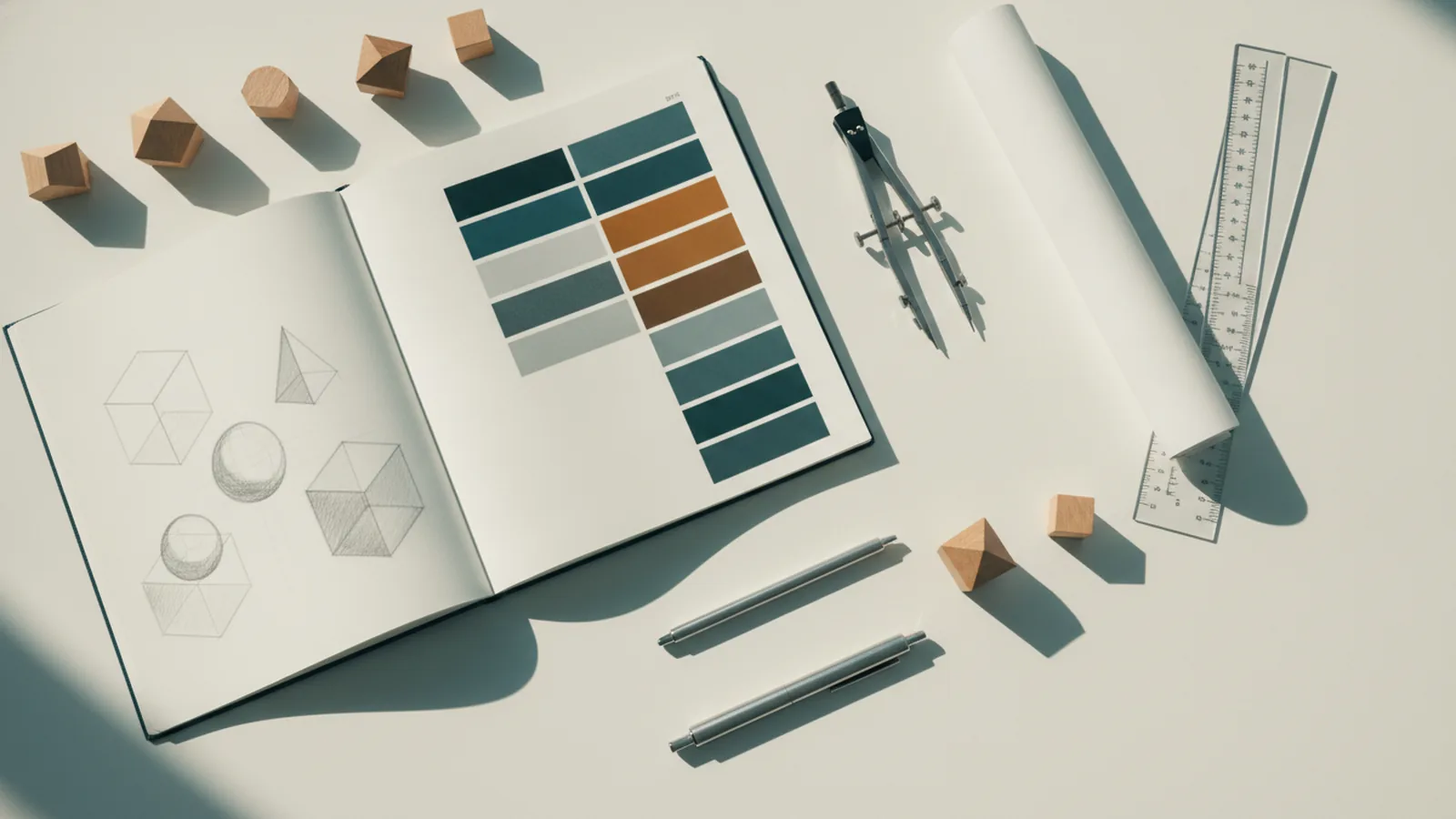
Start With the Brand, Not the Drawing
To create a meaningful logo, first define what the brand stands for. A strong mark reflects the brand’s essence. It also stays clear, distinct, and easy to recall.
Write down the brand’s purpose, promise, values, and audience. Then describe its personality in three to five words. A bank may feel calm and trusted. A skate brand may feel bold and free.
Next, study the audience. Learn what they value, buy, and expect from the category. Review customer reviews, surveys, and rival brands. This work gives your logo design process a clear base.
Research competitors with care. Note their colors, shapes, type styles, and overall tone. Look for patterns that make the market feel alike. Then find open space for brand differentiation.
- List the brand’s main promise
- Define three to five personality traits
- Describe the target audience in plain terms
- Map common visual styles in the category
- Choose one clear point of difference
Do not copy a rival’s look. A familiar style may seem safe, but it can blur your identity. Your goal is to feel right for the market while still being easy to tell apart.
Build Meaning With Simple Visual Choices
The best marks often use few parts. Simplicity helps people spot a mark at a glance. It also keeps the design useful at many sizes.
Relevance matters just as much. A mountain shape may suit an outdoor brand. It may feel wrong for a child care service. Choose forms that support the brand promise rather than explain every detail.
Uniqueness gives the design lasting value. You do not need a strange shape for its own sake. You need a fresh mix of form, space, color, and type.
Shape and form can guide mood. Rounded forms often feel warm and open. Sharp angles can feel fast, exact, or bold. Use these cues with care. Meaning comes from the whole system, not one shape alone.
| Design choice | Common effect | Useful question |
|---|---|---|
| Rounded forms | Warm and friendly | Does the brand need approachability? |
| Sharp forms | Fast and strong | Does the brand need energy? |
| Open space | Calm and clear | Can the mark breathe at small sizes? |
| Bold contrast | Direct and visible | Will it stand out in busy places? |
A meaningful logo should also work without a long explanation. If viewers need a full story before they see its value, simplify the idea. Let the design suggest the brand instead of spelling out every claim.

Follow a Clear Logo Creation Process
Begin with loose sketches. Use paper, a pencil, and a short timer. Make ten to twenty small ideas before judging any of them.
Small sketches help you explore freely. They also stop you from polishing one weak idea too soon. Try symbols, word shapes, initials, and abstract forms.
After the sketch stage, select three strong directions. Each direction should link to a brand trait. Write one sentence that explains the link. Remove any idea that needs a long defense.
Then digitize the best route. Build clean paths and test the mark in black and white first. This step reveals weak contrast and poor form before color distracts you.
- Set the brief. Record the purpose, audience, traits, uses, and limits.
- Study the market. Group rival marks by color, shape, and type style.
- Sketch many routes. Make quick ideas without editing each one.
- Choose three directions. Keep only concepts with a clear brand link.
- Build the design. Draw clean shapes and set the type with care.
- Test real uses. Check screens, print, signs, packaging, and small icons.
- Refine the system. Create clear rules for size, space, color, and type.
Keep the first brief close during each review. Ask whether each change improves clarity or fit. Avoid changes made only because they feel new.
Save each key version. This record helps you compare choices and explain why the final route won. It also makes later updates far easier.
Choose Color and Type With Intent
Color can shape first impressions. Blue may suggest trust or calm. Red can suggest energy or urgency. Green often links to growth, nature, or care.
These links are not fixed rules. Culture, category, shade, and contrast all change the result. Use color psychology as a guide, then test the actual design.
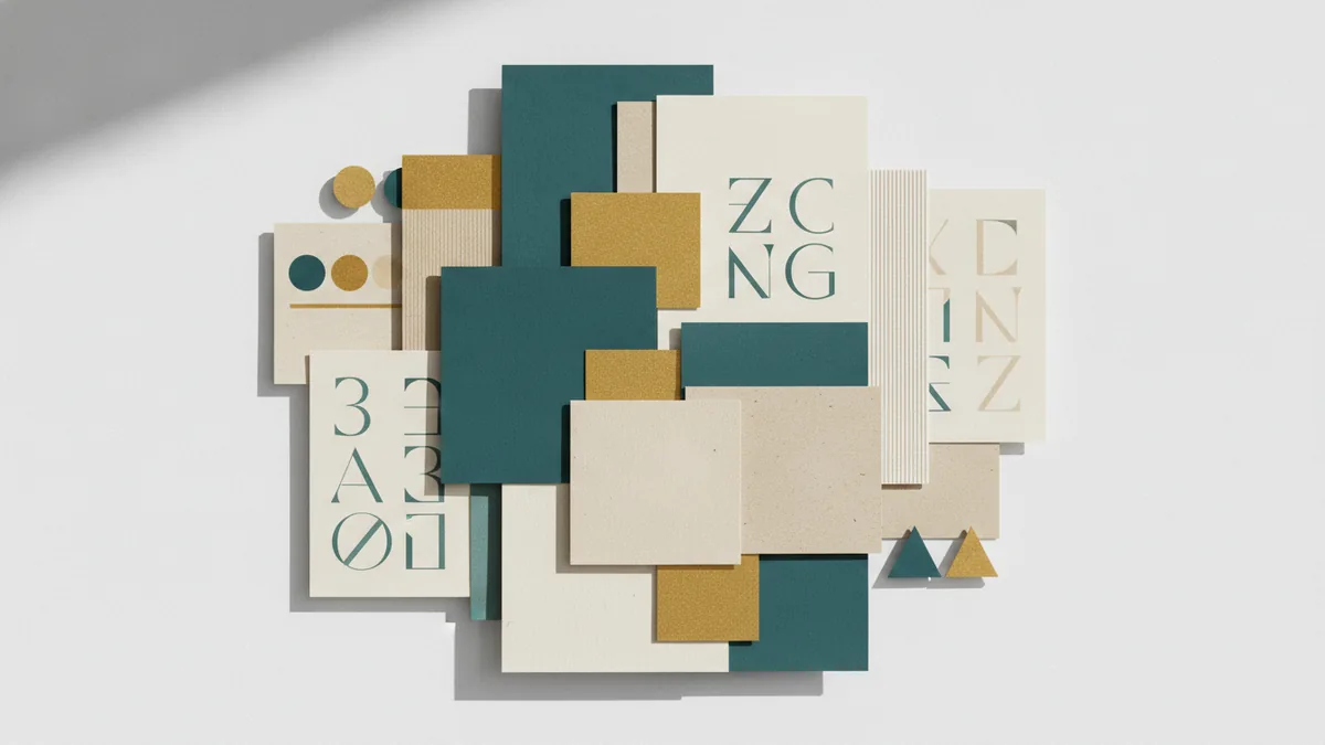
Start with one main color and one support color. Add a neutral tone for space and balance. Limit the core palette to two or three colors unless the brand needs more range.
Typography also conveys brand personality. A serif face may feel classic or refined. A sans serif face may feel clean and direct. A hand-drawn style may feel personal, but it can lose clarity at small sizes.
Check the type at real sizes. Read it at a small screen width and from a short distance on print. Avoid thin strokes, tight spacing, and hard-to-read letter shapes.
- Check color contrast in light and dark settings
- Test the mark in one color
- Pair type with the brand’s key traits
- Keep spacing even around the mark
- Check the design in color-blind viewing tools
Keep a useful balance between character and function. A bold style has value only if people can still read and recall it.

Test the Design Before You Commit
Testing shows how the design works beyond the design desk. Show the main routes to people in the target audience. Use the same size and setting for each option.
Ask focused questions. Which option do they notice first? What feeling does it create? What kind of company do they expect behind it? Can they recall its main shape after a short break?
Do not ask only whether people like the design. Likeability can hide weak recall or poor fit. Ask what they saw, felt, and remembered.
Test at least three settings. Use a small digital icon, a web header, and a print sample. Check signs, dark backgrounds, and one-color use when those settings matter.
A simple test can use ten to fifteen suitable viewers. Look for repeated patterns, not one person’s taste. If most viewers miss the same detail, revise that detail first.
Review the mark for logo usability. It should remain clear when reduced, cropped, printed, or placed beside other elements. It should also work without its full name when the brand gains recognition.
Avoid These Common Logo Mistakes
Too much detail is a frequent problem. Fine lines and tiny parts vanish in small spaces. Remove parts that do not add meaning.
Another mistake is following a trend too closely. A design may look fresh for one season, then feel dated. Build from the brand’s own traits instead.
Weak contrast can harm both style and access. A pale mark on a white field may fail in real use. Always check black, white, light, and dark versions.
Many new designs also use type without enough care. Poor spacing can make a strong word shape feel cheap. Test each letter pair and compare the full name at normal reading size.
- Using too many colors or effects
- Copying a rival’s visual style
- Relying on a hidden meaning
- Ignoring small-size use
- Skipping audience tests
- Changing the design by committee
Do not ask every reviewer to make a new design. Set clear goals for feedback. One person should guide the final choice against the brief.
Turn the Final Mark Into a Working System
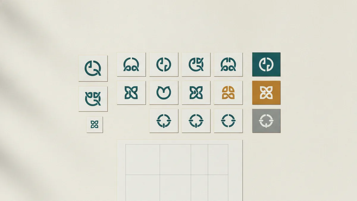
A logo is one part of a wider brand identity. Define how it appears with color, type, images, and space. These rules help every use feel linked.
Prepare files for real work. Keep a vector version for print and large signs. Keep clear digital files for websites and social profiles. Include light, dark, one-color, and small-use versions.
Write simple use rules. State the minimum size, safe space, approved colors, and banned changes. This protects recognition as more teams use the mark.
Review the design after launch. Watch how people respond across real channels. Small refinements may help, but avoid change without a clear need.
Meaning grows through repeated use. A clear mark, steady style, and useful brand promise will strengthen recall over time.
Next Steps for a Stronger Brand Mark
Start with a short brand brief before opening design software. Define the audience, promise, traits, and market gap. Then sketch several routes and test the strongest three.
Choose the route that best joins meaning, clarity, and use. Check it in color and one tone. Test small sizes and real settings before final delivery.
The best answer to how to create a meaningful logo is not one clever trick. It is a clear process from brand insight to audience testing. Keep the design simple, relevant, and distinct.
When each choice supports the essence of the brand, recognition becomes easier. The result can stay useful long after current design trends fade.
How to do it
- Define the brand briefWrite the brand promise, audience, values, personality, key uses, and design limits.
- Research the marketReview competitor colors, forms, and type styles. Find a clear space for difference.
- Sketch many ideasMake ten to twenty quick sketches. Try symbols, word shapes, initials, and abstract forms.
- Select and digitize routesChoose three strong ideas with clear brand links. Build clean versions and test them in black and white.
- Set color and typeChoose a focused palette and type style that match the brand. Check contrast and small-size clarity.
- Test and refineShow the routes to the target audience in real settings. Revise repeated problems, then prepare final files.
Frequently asked questions
How do you create a meaningful logo?
Begin by defining the brand promise, audience, values, and personality. Then study competitors, sketch several ideas, and test the strongest routes.
What makes a logo meaningful?
A strong logo is simple, relevant, unique, and easy to use at many sizes. It should reflect the brand without needing a long explanation.
How do I choose colors for a brand logo?
Choose colors that support the brand’s values and audience. Test the palette in light, dark, one-color, and small-size settings.
Why should I sketch a logo before digitizing it?
Sketch ideas by hand before using design software. Quick sketches help you explore more concepts without polishing weak ideas too soon.
How do you test a logo with a target audience?
Show several routes to suitable viewers and ask what they notice, feel, and remember. Use repeated feedback patterns to guide changes.
What are common logo design mistakes?
Avoid complex details, weak contrast, trend copying, poor type spacing, and unclear feedback. Test the design in real settings before launch.
Share this article
Related articles


Building something similar?
Tell us about your product — we respond within one business day with a concrete next step.