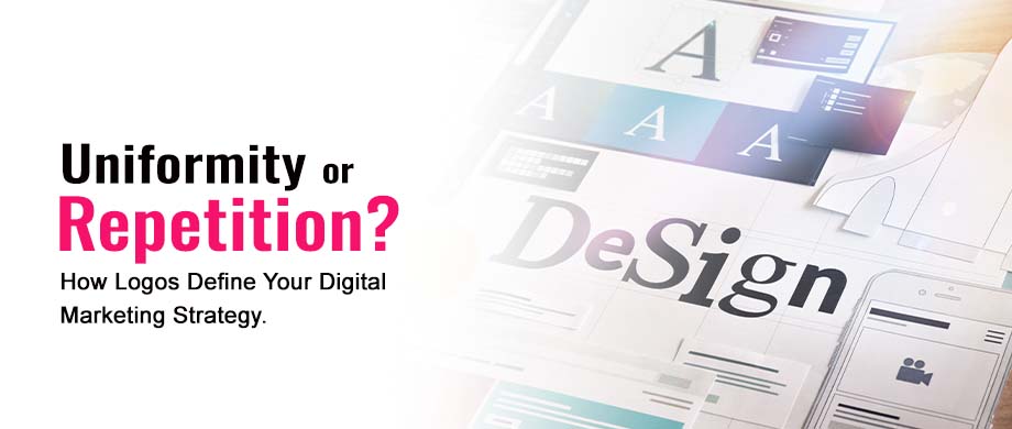
Uniformity or Repetition? How Logos Define Your Digital Marketing Strategy
The idea of using the exact same colors, dimensions, style, and theme might seem like you’re just repeating yourself, but from a design and marketing standpoint, there couldn’t be anything better.
So when the design stays the same, it does have the potential of creating friction for your digital marketing strategy, especially if you are bringing some influencers into the mix. But there is always a good reason for uniformity, so let’s clear it up here!
Logos - The Basics of Your Digital Marketing Efforts
Even the best logo design company will know there is no value in constantly changing your design, which will only add to your problems. So, if you’re looking to hire one, be sure to know this beforehand so you can better gauge their ability in handling potential problems like these, because if the best doesn’t get you this, they probably aren’t.
A brand is more than just a logo and its design; the logo is its visual identity, meaning it plays a crucial role in brand recognition. Its role cannot be emphasized enough, especially in the wake of current trends of constantly redesigning everything to fit the modern and most ‘current’ trends. Even if your brand uses the most effective influencer marketing TikTok can provide, you’ll still be left with plenty on the table if your design changes too often.
However, one needs to understand that brand recognition is tied to identity, not the design itself. That is why a brand such as Coca-Cola or even online brands like Google and Firefox can constantly redesign themselves but keep their visual identity.
But before we get to that, let us get through the idea of brand recognition and identity first.
Brand Identity
Before we get to any recognition, we need something to be recognized, and in this context, it is the brand and the identity it has created around itself. It doesn’t necessarily have to be a visual identity, but the visuals matter.
Take Red Bull as an example. It is a brand more recognized for its daredevil stunts and high-octane feats. When it launches a new marketing campaign, there is always some line the stunt crosses, some record it breaks, or something new done to make it not just memorable as a marketing campaign but as a stunt as well.
Sure, the brand has a logo and everything. But those colors are merely fluff when the brand’s identity is considered.
However, for a brand such as Coca-Cola, its red-and-white markup is a huge part of its identity. Sure, its a soft drink label, but that’s not all the Coca-Cola brand does, so it needs to differentiate itself through something, and it does so with its mix of complex and simple designs.
Brand Recognition
Once the brand’s identity is figured out, next comes its recognition, an integral part of the process where the brand needs to be correctly identified by an audience when there may or may not be other brands present.
Going back to our Coca-Cola example, you need to be able to spot a Coca-Cola can in a fridge filled with many soft drink labels. You recognize the dual arches (not the letter M!) of McDonald's. You are familiar with the Colonel Sander’s mascot in the Kentucky Fried Chicken (KFC) restaurants.
Your familiarity comes with both identity and uniformity in their visual design. There can still be design revisions over the years, but if the identity keeps up with it, the redesign can bring something fresh and new.
Sometimes, the revisions are minimal, if at all. Tech companies often do this, only making minimal changes over many years as their visual elements are critical for recognition. However, there is also something unique about tech companies and almost any company existing online that has yet to be fully tapped, which is taking advantage of brand partitioning without sacrificing design uniformity.
A Different Type of Rebranding
We’ve already discussed how hiring designers requires that you account for the different types of expertise they might have and how that might limit you in your pursuit of following trends and pivoting when necessary.
Google can be used as an excellent example of this potential. The online brand and the Google product are synonymous with search engines and tech excellence. However, the company is a brand of its own as one of the best places to work, with an excellent office environment, many perks, and much more. That reputation did suffer a setback in 2023 due to layoffs and a cut in some perks but it still holds its position as one of the best places to work.
This is an example of a brand separating into two different brands without sacrificing either one. It creates this dual perception where someone looking at a billboard that says ‘Google’ will think of either the company or the search engine without one cannibalizing the other. Here, uniformity and consistency can be maintained with the different branding identities being reinforced based on other contexts.
Physical vs. Digital Advertising
Different elements of design add new elements to consider, but there is a fundamental difference between physical media and digital. A piece of paper with your logo will feel much different than your logo on a screen, and something like a billboard or a large poster will have even more disparity. That is unless you account for it beforehand.
Digital marketing also has the benefit of using influencers more often and effectively. A tiktok marketing agency that represents tens of hundreds of influencers will want a product that can be advertised via social media more often as well.
However, physical advertising has its benefits as well. The most important one out of all, and the only focus here, will be that it’s significantly more real. A physical advertisements makes the digital feel more tangible, and thus can have more lasting value. However, there are things that are needed to consider to make it happen.
Physical Advertising
Take billboards as an example. Logos shouldn’t be designed for billboards after the fact. In some designs, it is all too possible for the regular, digital versions of the logo to look fine, but when their size is increased significantly, chances are they will not look anywhere near as good. This potential problem can arise–and subsequently be solved–well before the logo is made and finalized.
There are plenty of considerations to make, though not as cardinal rules. However, keeping billboard logos simple and to the point is a good practice. Remember, the logo design will most likely be seen by people in cars, speeding or otherwise, who cannot have their attention diverted for too long. In fact, making a deliberately distracting logo design in the middle of a freeway can be grounds for legal trouble.
In making billboard designs, it’s common to consider that it should take no more than three seconds for a billboard design and logo to be read and understood by its audience, which means you can certainly market using your billboard but not sell with it.
What does this mean?
Simple. No call numbers, no emails, or any such information. At least not as the focus of the billboard. You can include it, but it's not the purpose. The point of the billboard is to get eyes on it and eyes on your brand because nobody will pull up their phone and immediately buy something while they’re driving in the middle of the road–even if you discount the safety hazards that present.
Uniformity vs Repetition
Most brands need to keep their logo the same as they’ve always had it, though rebranding efforts are quite common. However, uniformity doesn’t mean repetition, nor does it have to.
For one, uniformity and consistency are necessary for any company to make a brand. Without something recognizable, it can be extremely difficult–if not impossible–to create a lasting brand identity that allows for that consistency in the first place.
You can spot a restaurant far away while driving in a car because of the sign that is almost always uniquely ‘foody,’ even if the same is something completely unrelated to food. After all, there isn’t anything about food in the name of McDonald’s, Starbucks, or Domino’s. These fast-food chains became so through branding and brand identity, each with their own spin on it.
The creativity that logos and their designs demand has to exist within the limits of that brand identity. Brands can change their logos and colors and everything else, but if it fits the overall theme, it can be viable. Consistency itself doesn’t create recognition, but develop it further after it has been created.